- You have not saved any projects.
Total Vision Care
Total Vision Care was designed to be the prototype for a regional chain. The project’s two main objectives were to cue customers to purchase “add-on” products and services not covered by their insurance, and to transform the store’s previous layout into a retail-driven environment with a smooth transition from station to station. The store’s products are organized by category with corresponding graphics for Men’s, Women’s, Sports and Safety.
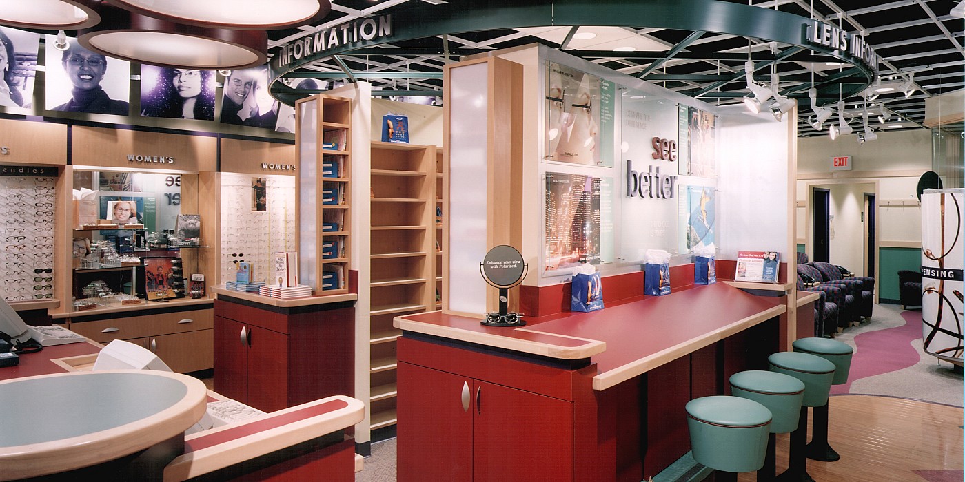
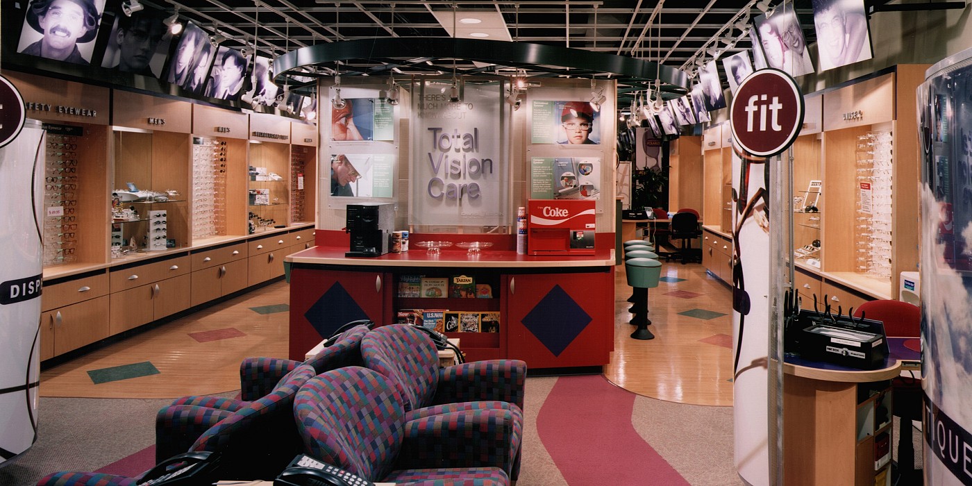
The merchandising concept by Shook Kelley is based on “fit”—contacts and eyeglasses that fit your lifestyle, fit your budget and fit your healthcare needs. Upon entry into the store, customers are greeted by staff in a stationed area who direct the stages of their visit. Customer waiting area and refreshment zone are not only comfortable but also informative. Oversize graphics were developed to cue customers to purchase “add-on”products and services. Dynamic graphic screens were created for the fitting station and eye contact boutique to help designate fitting station locations, while providing a degree of privacy to the customer.
The theme is reinforced with icons situated at the top of curved screens that provide privacy while customers make their eye wear purchasing decisions. The merchandising color scheme uses purple (communicating fashion and power) in the front of the store, where products are displayed much like a boutique retail environment. The customer service areas use yellow to communicate friendliness, and the exam rooms are green, the color of health and reliability. Fitting and dispensing areas are highlighted with red, representing the body and earth.
Since the new store prototype opened, customer response was so positive that the eye care company began immediate plans to open additional stores based on this real-life prototype.
