- You have not saved any projects.
Amigos
Amigos, a contemporary Mexican-American grocery store chain, was looking for more competitive distinction in their West Texas marketplace. One of three grocery concepts owned by The United Family, Amigos needed to demonstrate its relevance by avoiding both the common tropes of a generalist grocery store brand and steering clear of “themed” Hispanic or Mexican approaches.
Shook Kelley developed two projects for the brand: A new identity that better represented the spirit of Amigos and a brand book that defined the tenets of the brand for the organization.
Amigos’ ambition was to provide a higher standard of supermarket experience and raise the quality of life for underserved Mexican-Americans throughout West Texas. Amigos filled a community void by solving cross-cultural problems that other places didn’t.
Amigos filled a community void by solving cross-cultural problems that other places didn’t.
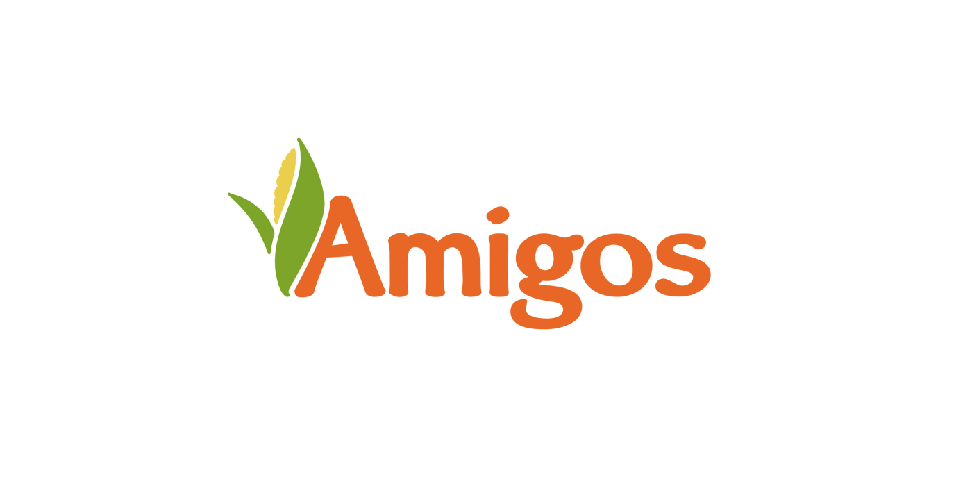
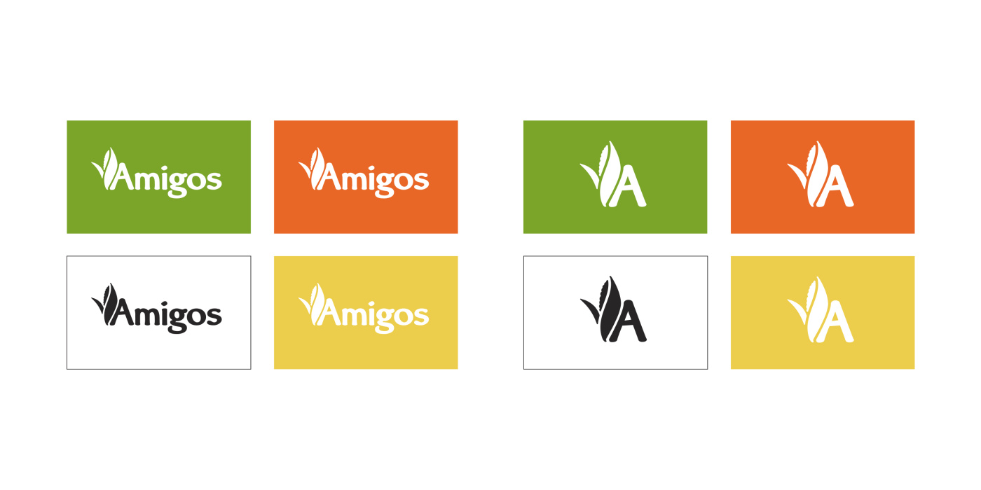
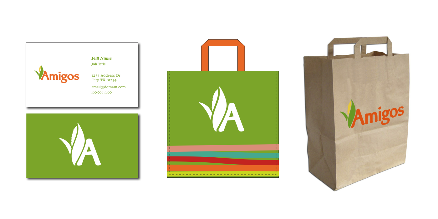
Aiming to capture the brand’s cross cultural spirit, a corn icon was used in the logo to reference traditional Mexican and American cuisines, as well as today’s Mexican-American communities in Texas. The warm and friendly typeface suggested a modern interpretation of traditional handcrafts, while capturing the casual atmosphere of a family kitchen’s cooking, recipes and traditions. The vibrant and energetic color palette appropriately reflected a contemporary Mexican and American spirit. Together, these elements set the tone for a uniquely Mexican-American brand.
Shook Kelley developed two projects for the brand: A new identity that better represented the spirit of Amigos and a brand book that defined the tenets of the brand for the organization.
Amigos’ ambition was to provide a higher standard of supermarket experience and raise the quality of life for underserved Mexican-Americans throughout West Texas. Amigos filled a community void by solving cross-cultural problems that other places didn’t.
Amigos filled a community void by solving cross-cultural problems that other places didn’t.
Aiming to capture the brand’s cross cultural spirit, a corn icon was used in the logo to reference traditional Mexican and American cuisines, as well as today’s Mexican-American communities in Texas. The warm and friendly typeface suggested a modern interpretation of traditional handcrafts, while capturing the casual atmosphere of a family kitchen’s cooking, recipes and traditions. The vibrant and energetic color palette appropriately reflected a contemporary Mexican and American spirit. Together, these elements set the tone for a uniquely Mexican-American brand.