- You have not saved any projects.
Mercado González
Northgate González Markets, a regional chain of Hispanic grocery stores, was veering towards being more mainstream and traditional in its approach and store design. Shook Kelley identified the need and opportunity to revisit the family’s roots and origin story in order to develop a brand experience that had more soul and shared a more meaningful touchpoint for the Mexican community, which would simultaneously increase its appeal to non-Hispanic audiences.
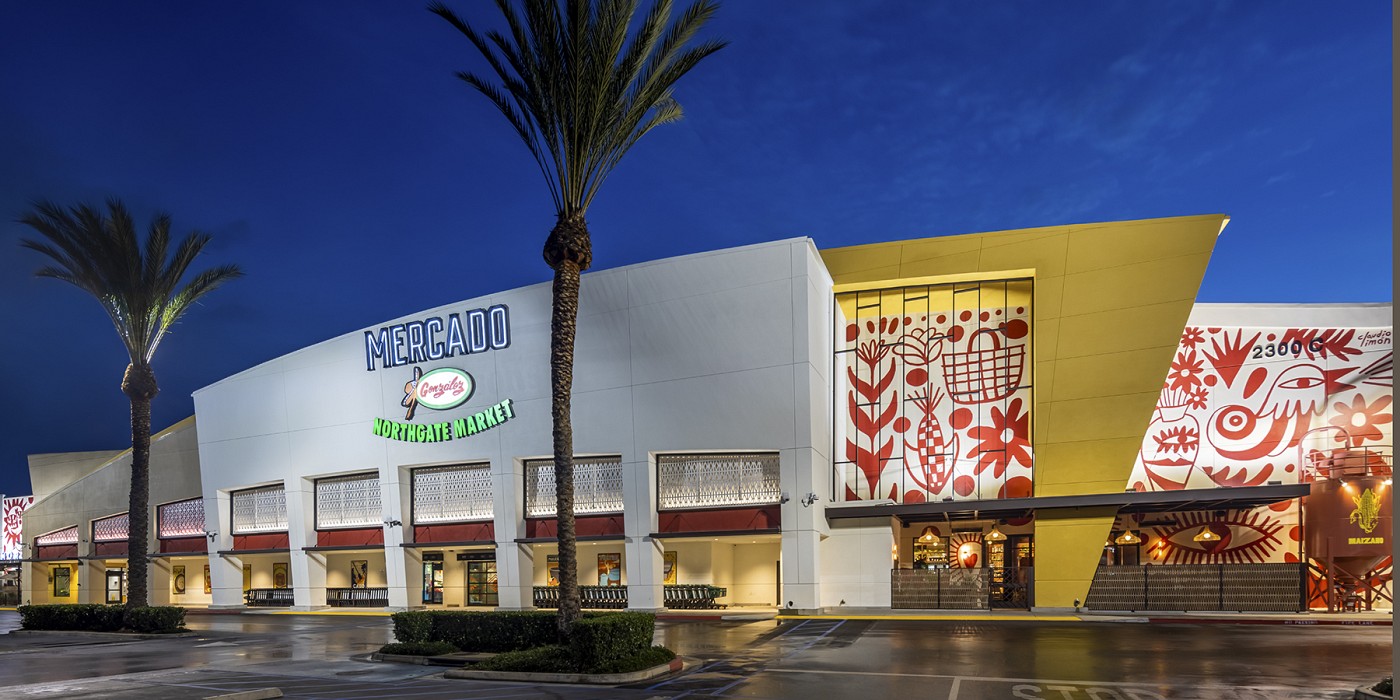

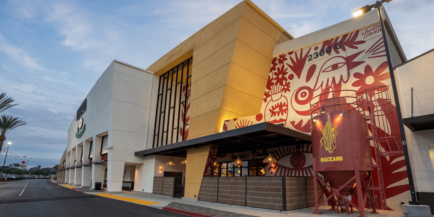
Branded as a new format, Mercado González, Shook Kelley designed a unique food shopping and dining experience unlike any traditional grocery store, specialty food market or food hall. It is a rich and robust cultural food journey through Mexico, but based in Southern California.
Shook Kelley developed the idea of creating a “pipeline” of authentic culture between Mexico and Southern California, importing the familiar flavors, sounds, and visual palette that the local Mexican community is familiar with and nostalgic for. Whether long-time immigrants seeking out a memory, new immigrants missing home, or American-born second or third generation immigrants looking for a taste of their heritage, the mercado format created the perfect context for achieving this design goal and differentiating from the industry.
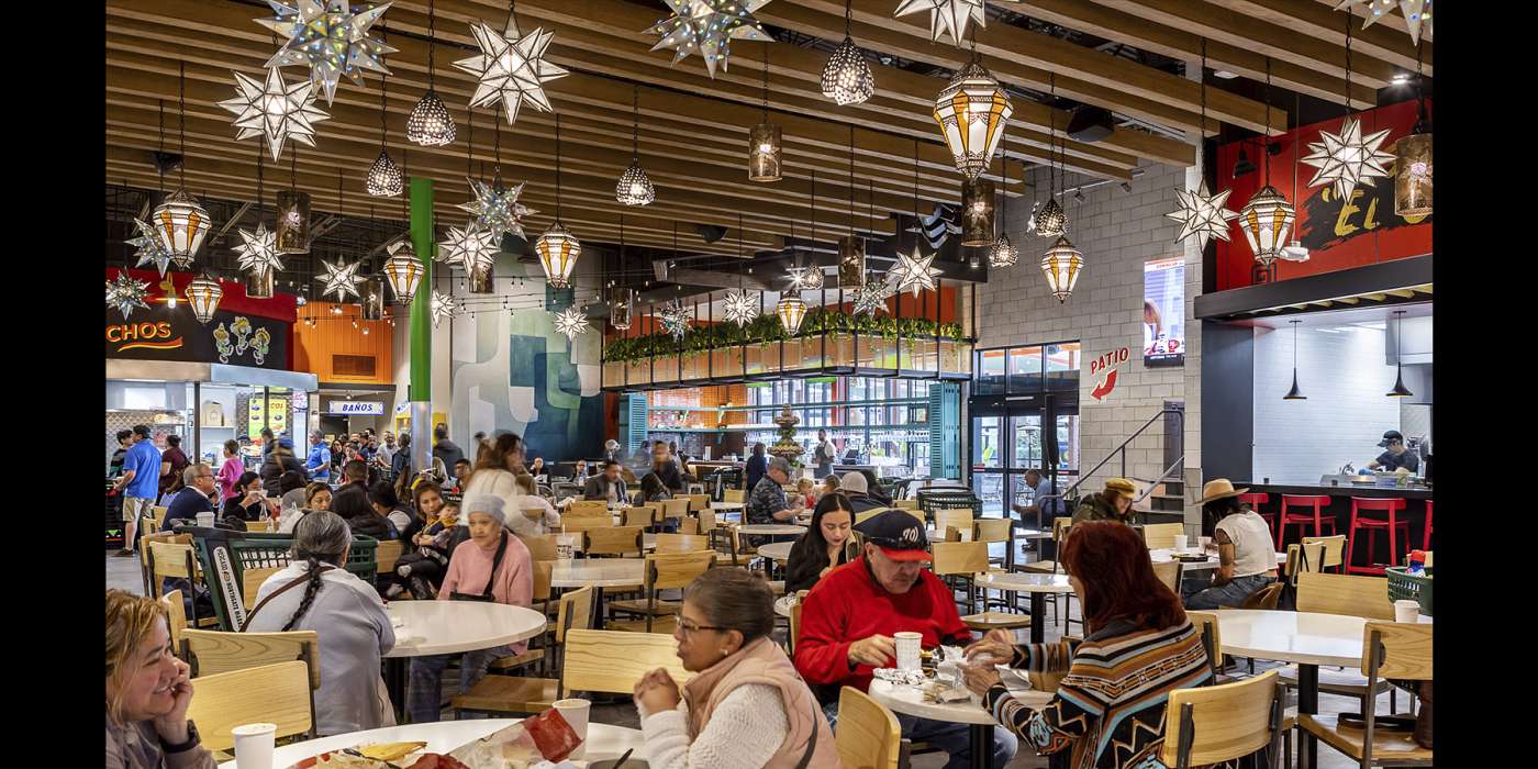
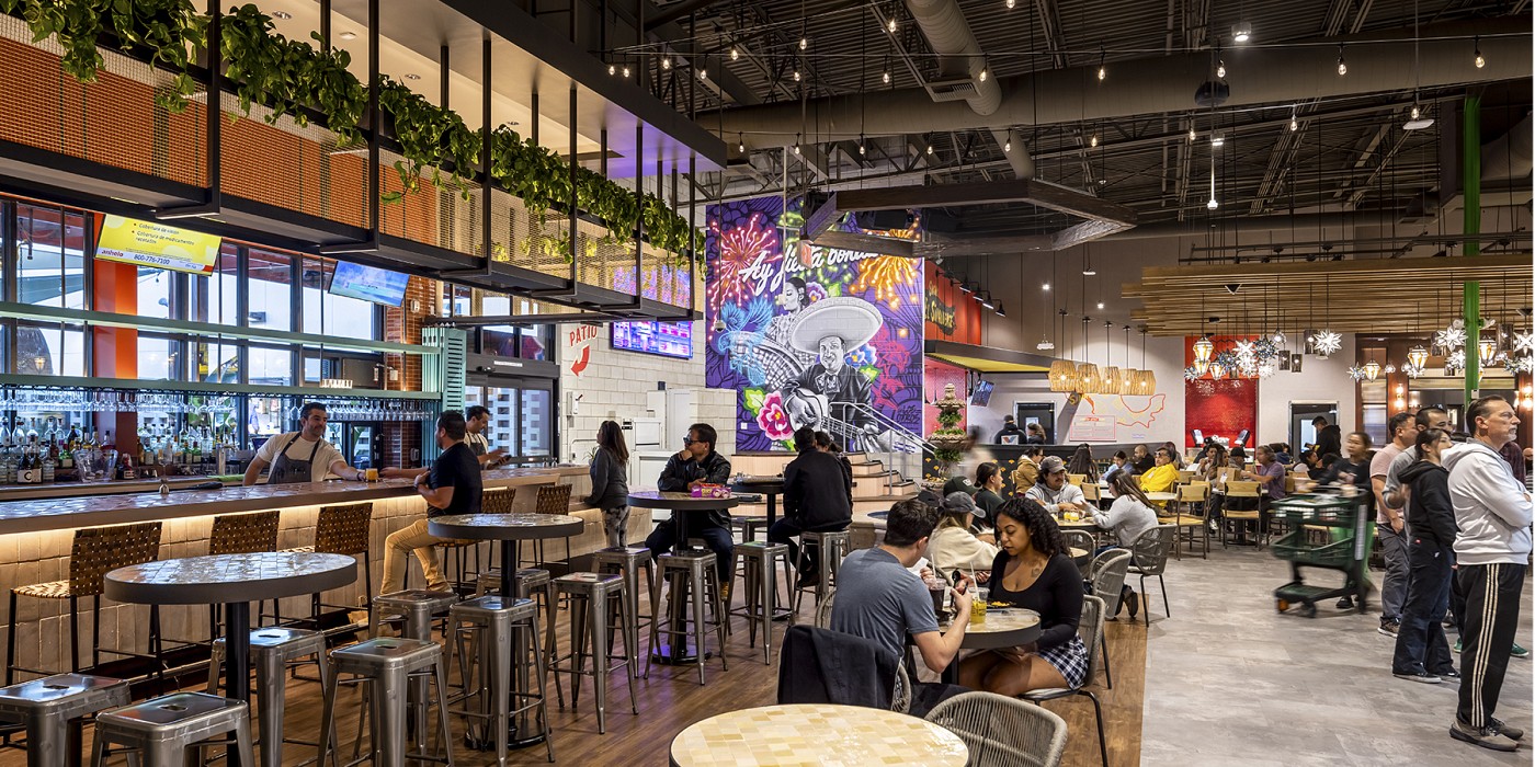
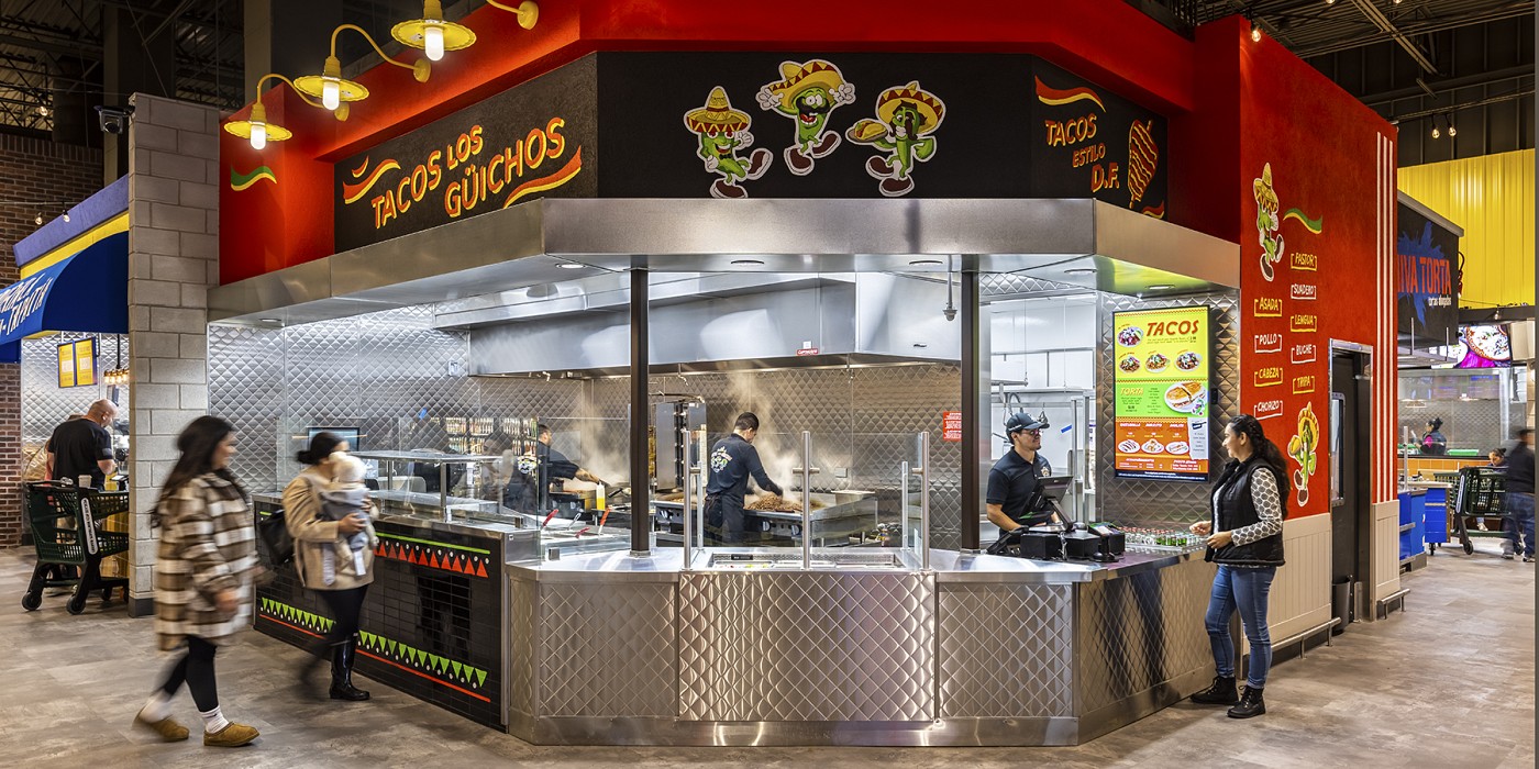
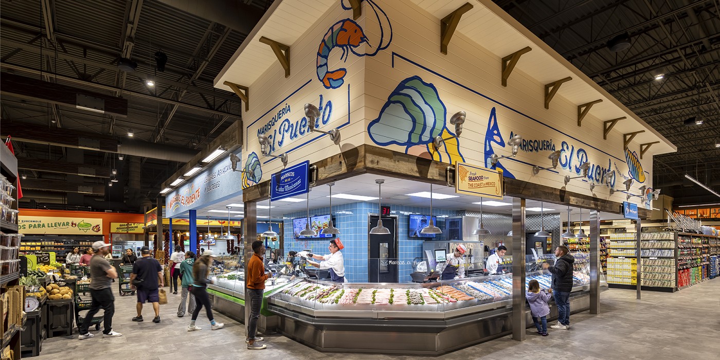
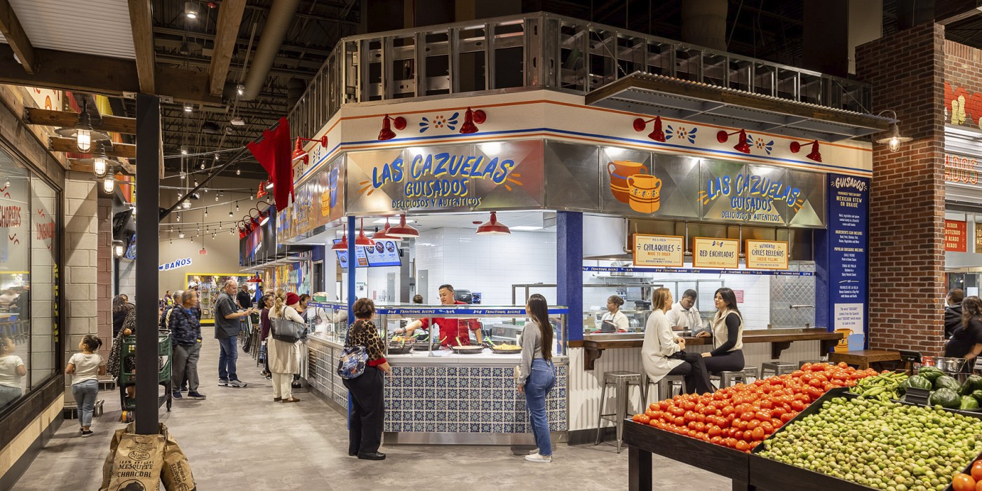
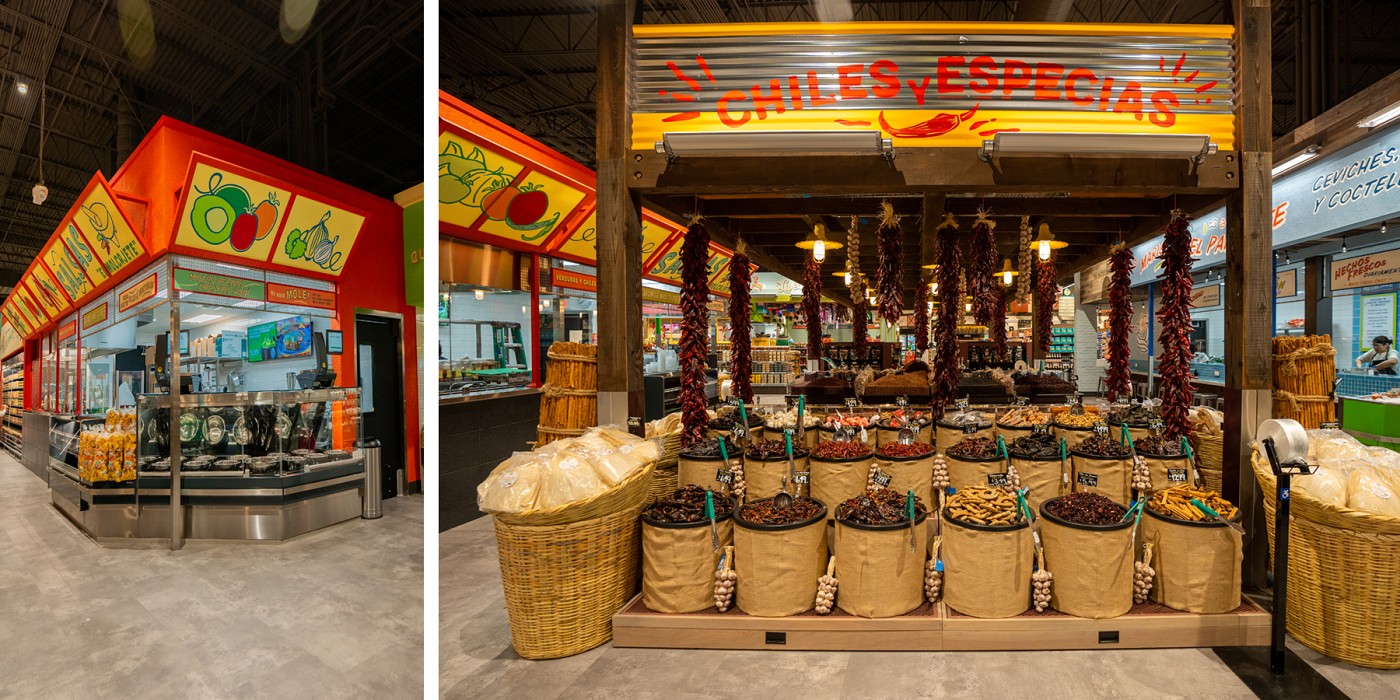
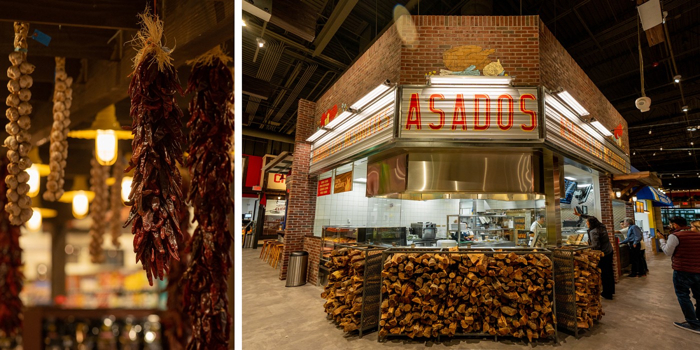
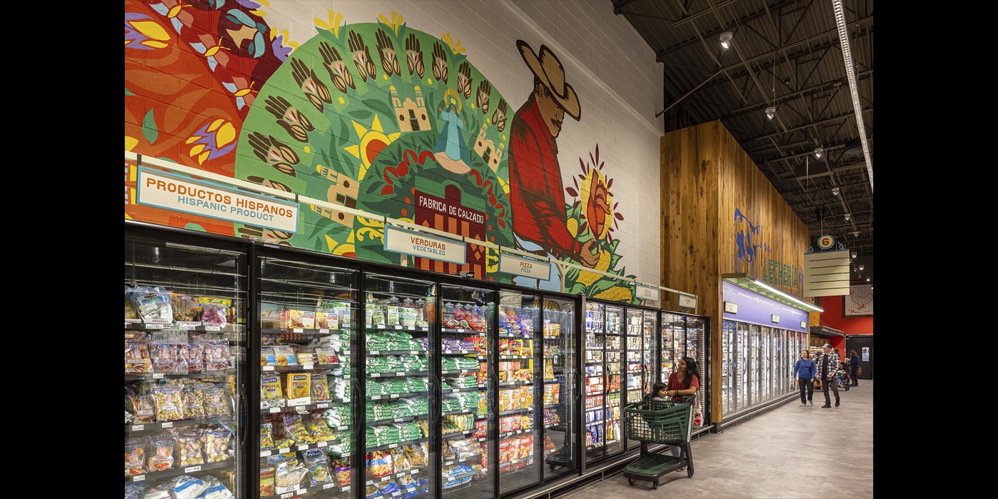
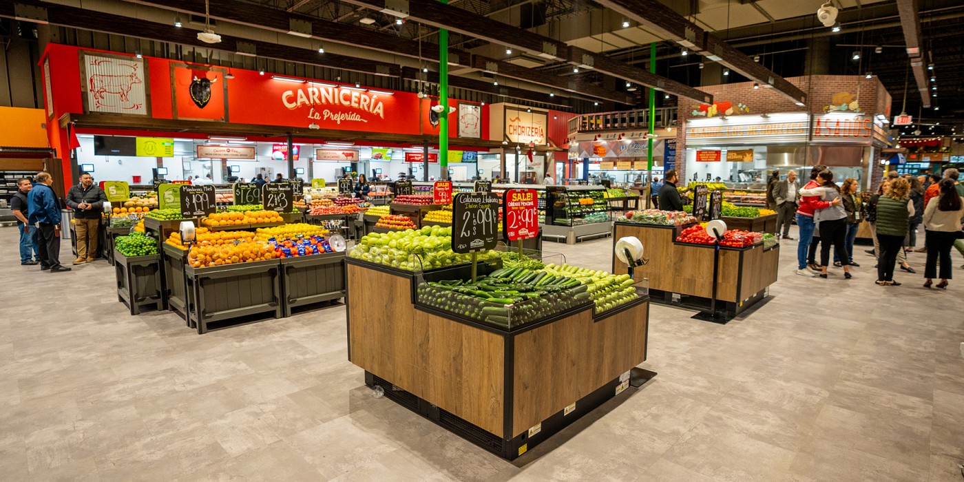
A mercado in Mexico is a traditional marketplace, the kind that eschews the trappings of a typical American supermarket with its bright lights, uniform look and packaged foods. It’s a hub of different individual, specialty merchants that set up their own puestos (stalls), each named and decorated to suit, with an old world approach to visual merchandising. Displays are lush, the senses are piqued, and everything is visible. Shoppers mingle alongside diners. It is not like your standard American supermarket down the street. Shook Kelley worked with Northgate to identify the most compelling parts of a Mexican mercado, and then developed a design that transported its most iconic elements into the gutted former space of a conventional supermarket.
It's a “pipeline” of authentic culture between Mexico and Southern California.
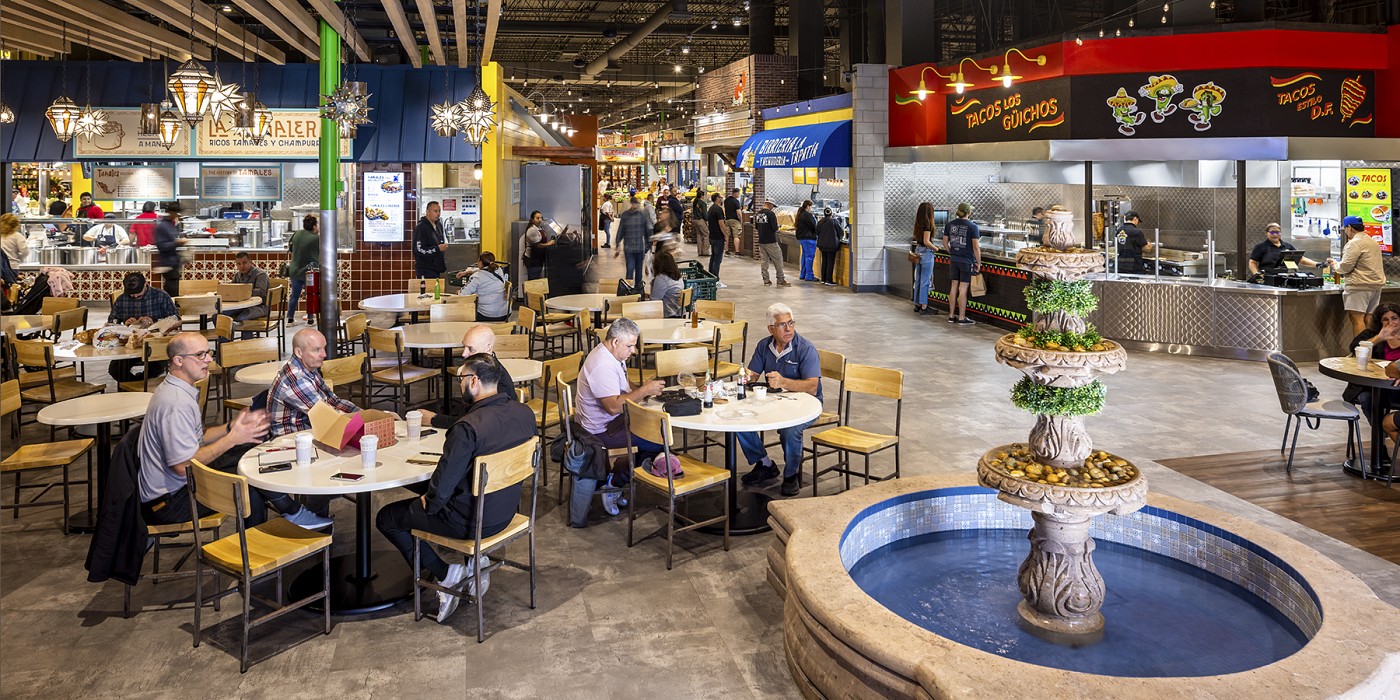
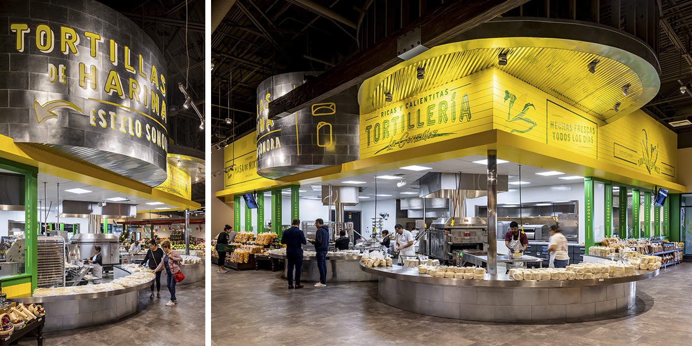
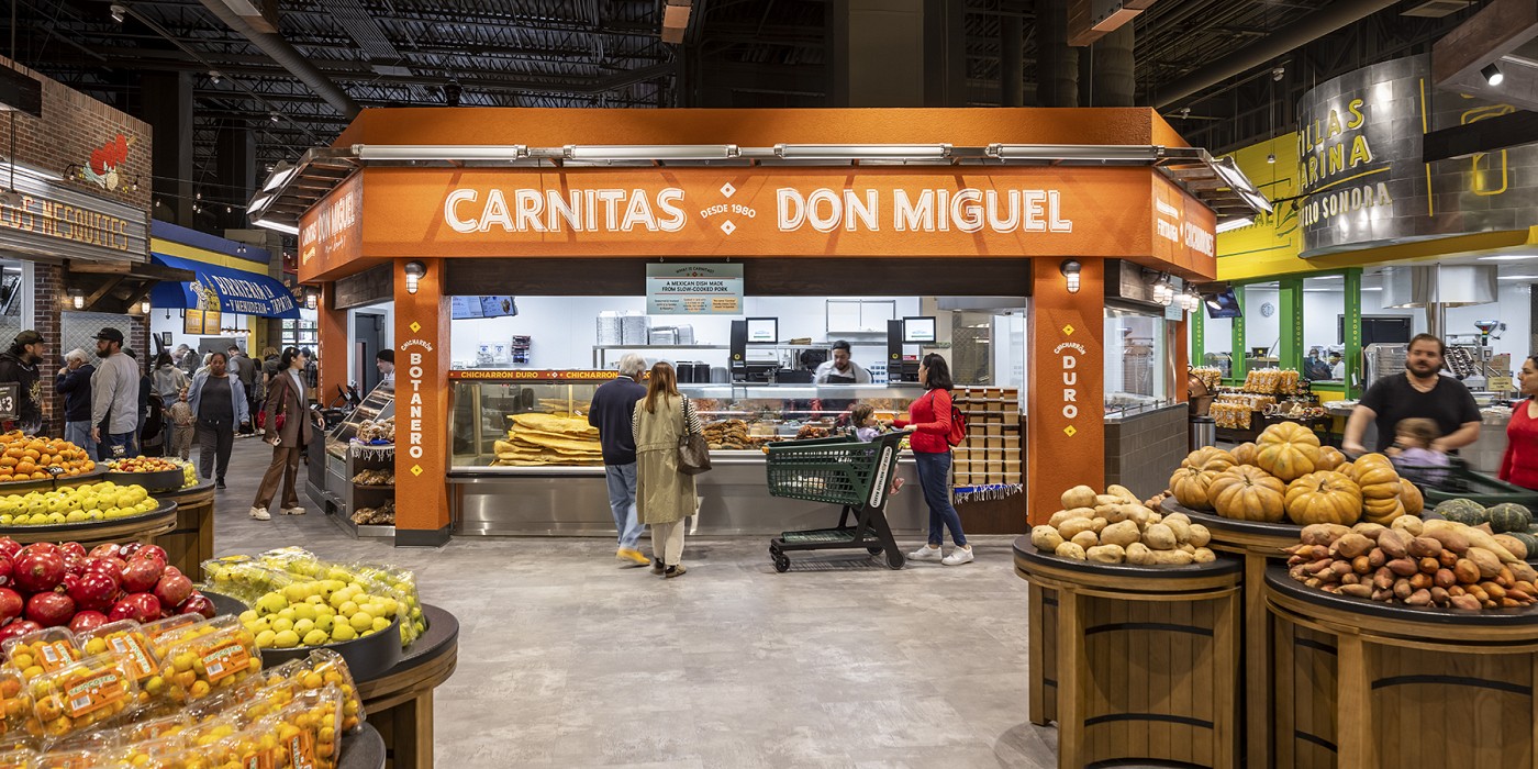
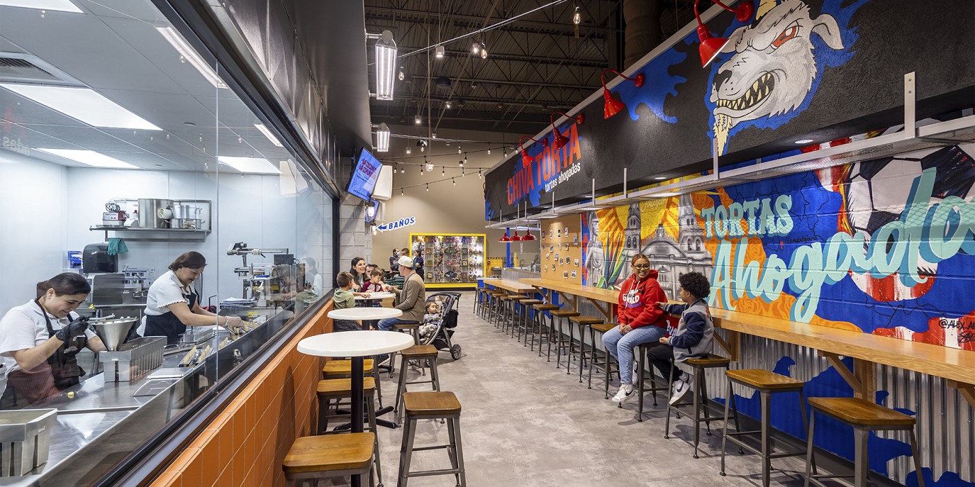
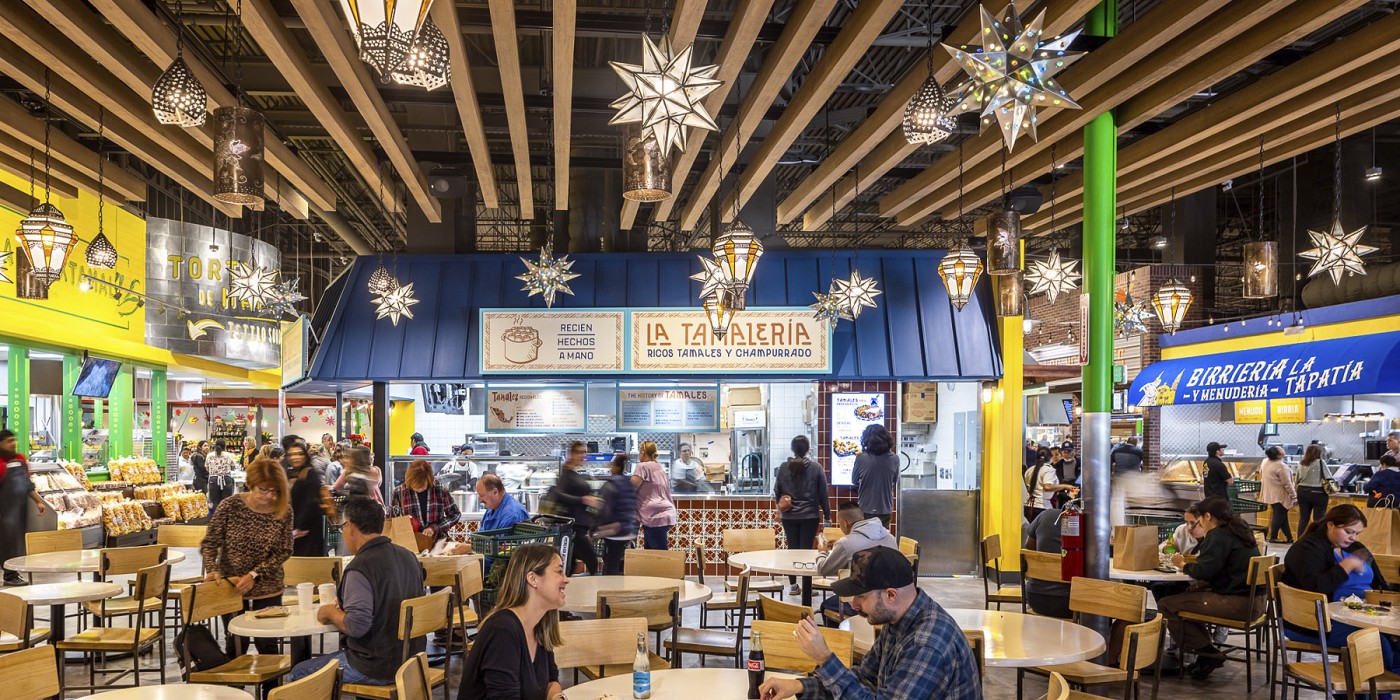
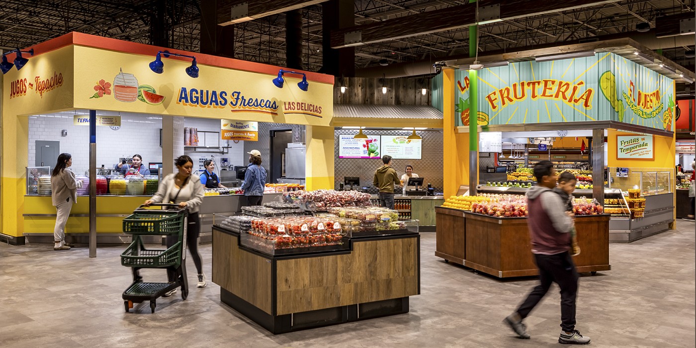
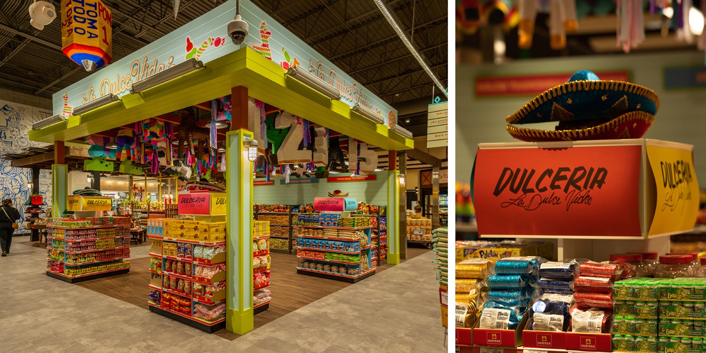
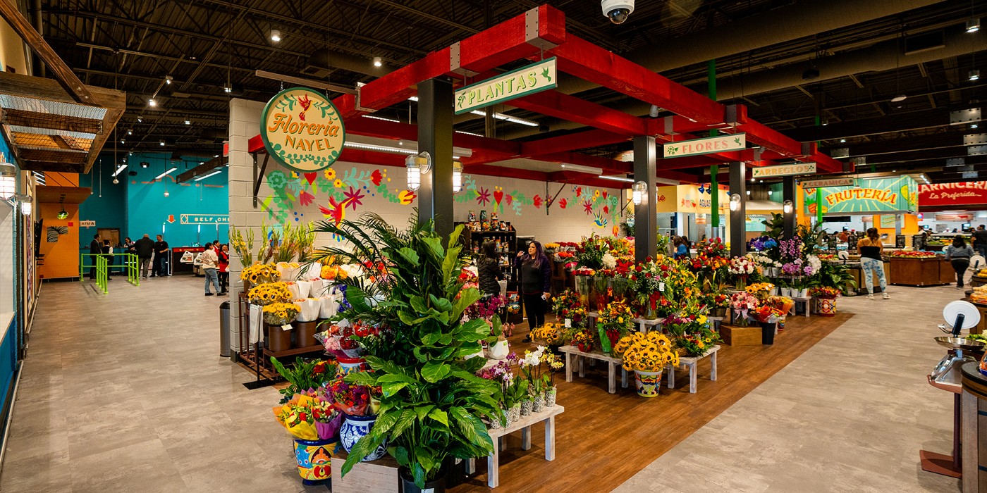
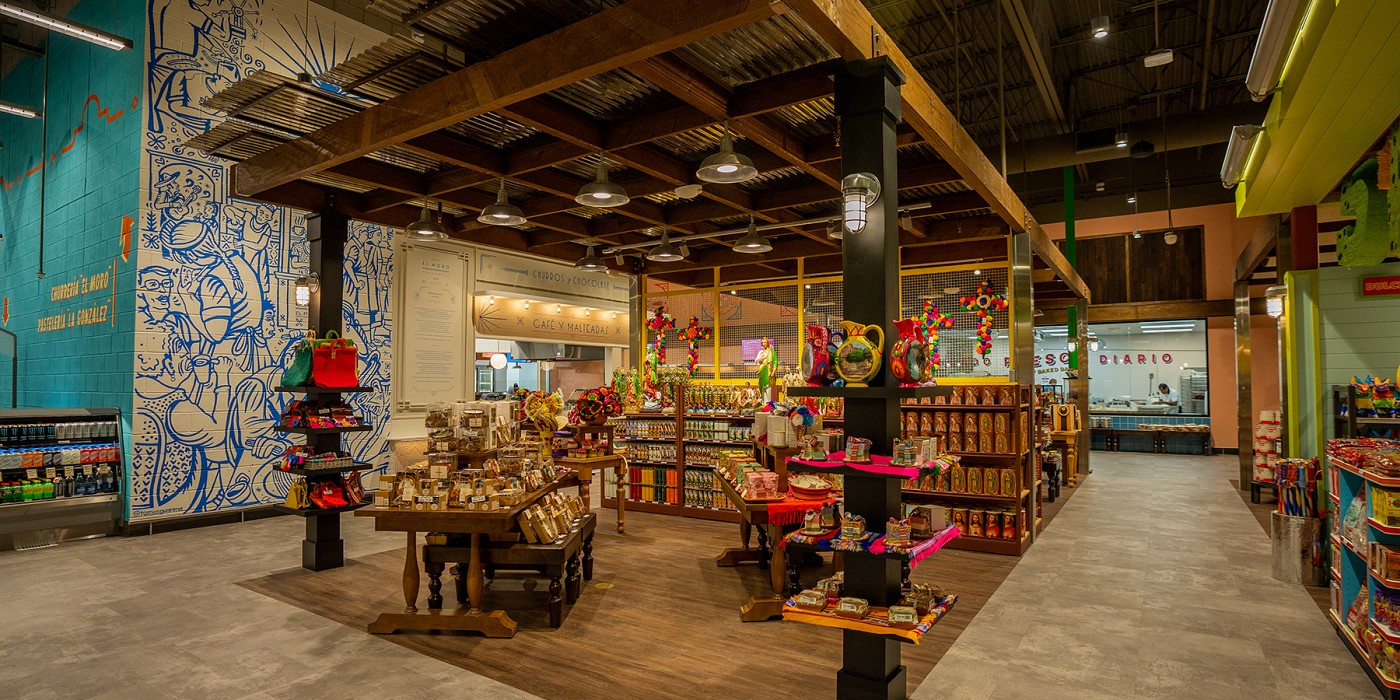
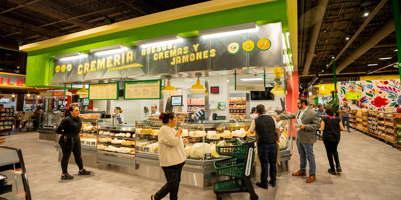
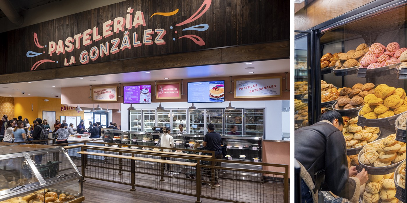
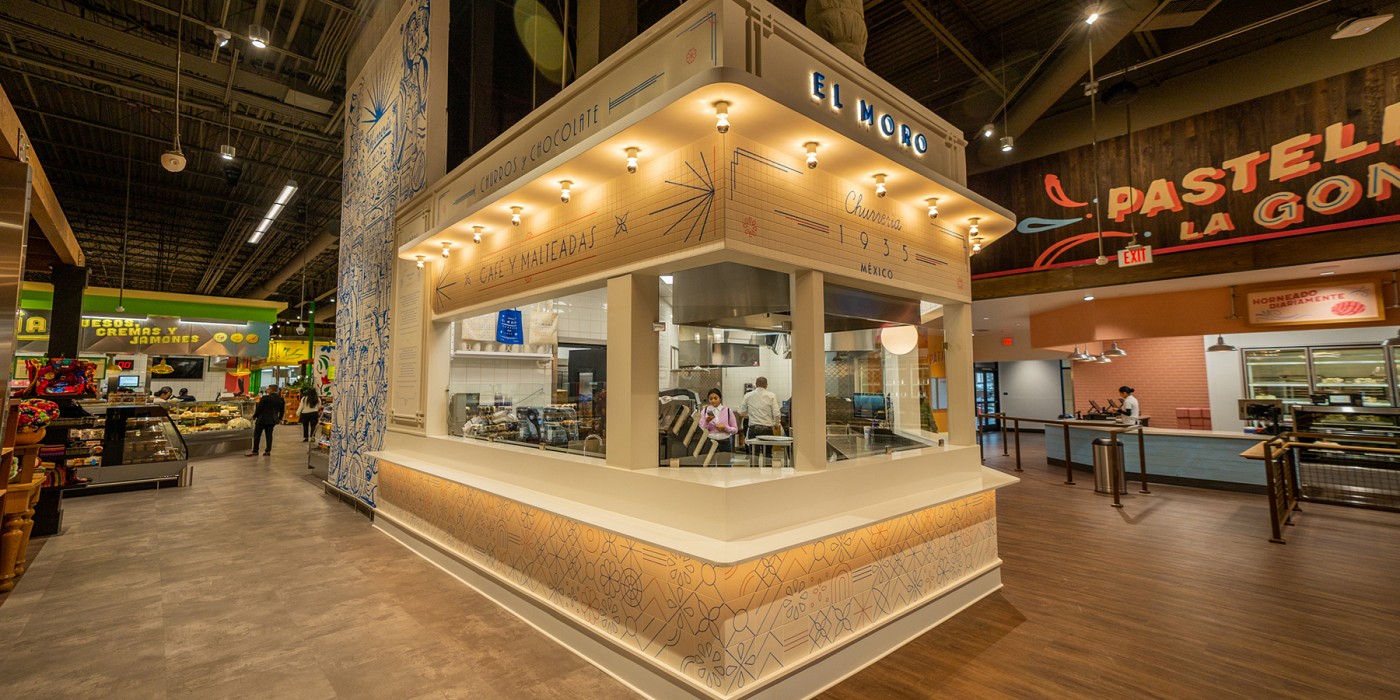
The design broke from traditional supermarket concepts such as locating fresh departments (e.g. deli or butcher) along the perimeter of the store, with rows of packaged products filling the middle. Instead, every unique product category was treated as its own puesto (stall), with its own expert merchant and special recipes cooked in-store. Puestos were designed as standalone stalls with their own individual names, finishes, materials, graphics and signage. They fill the entire floor of the space, creating multiple “streets” or “alleys” to explore, and a circulation flow of discovery rather than the efficiency of gridded straight lines.
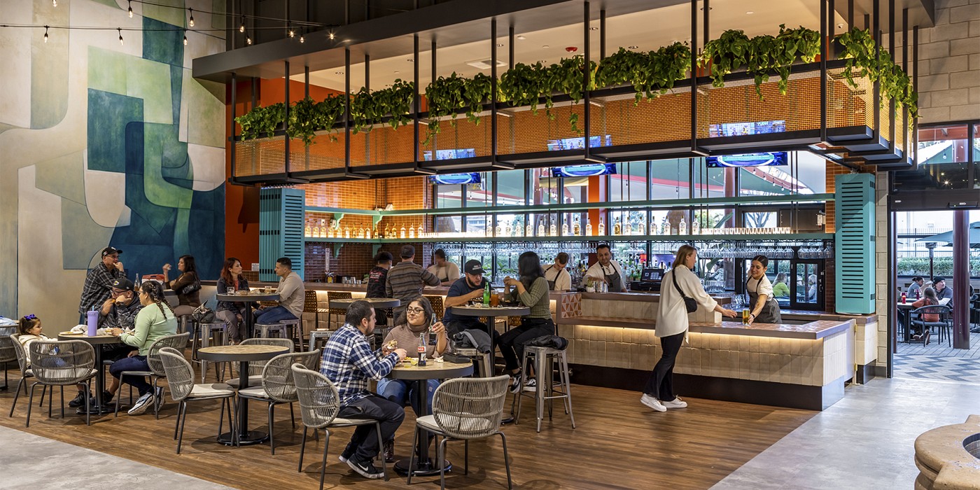
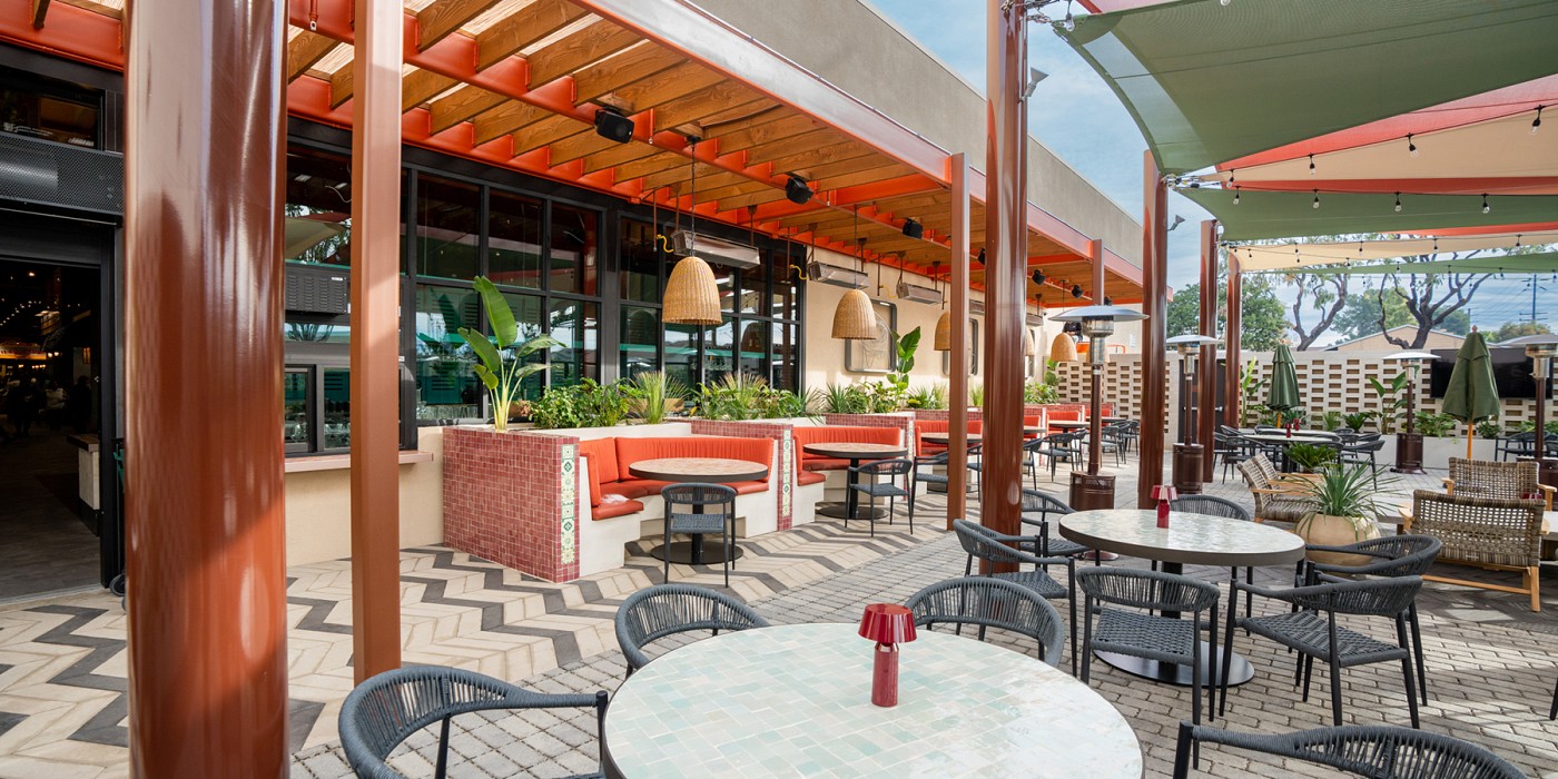
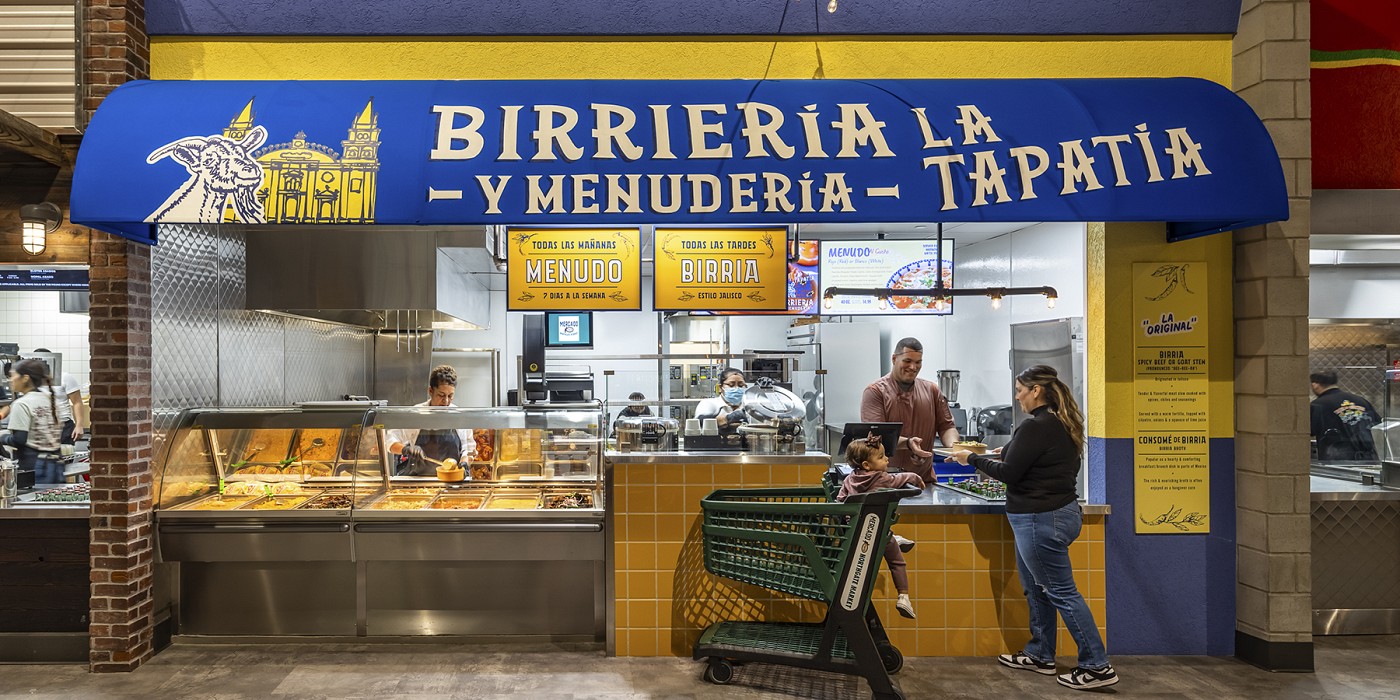
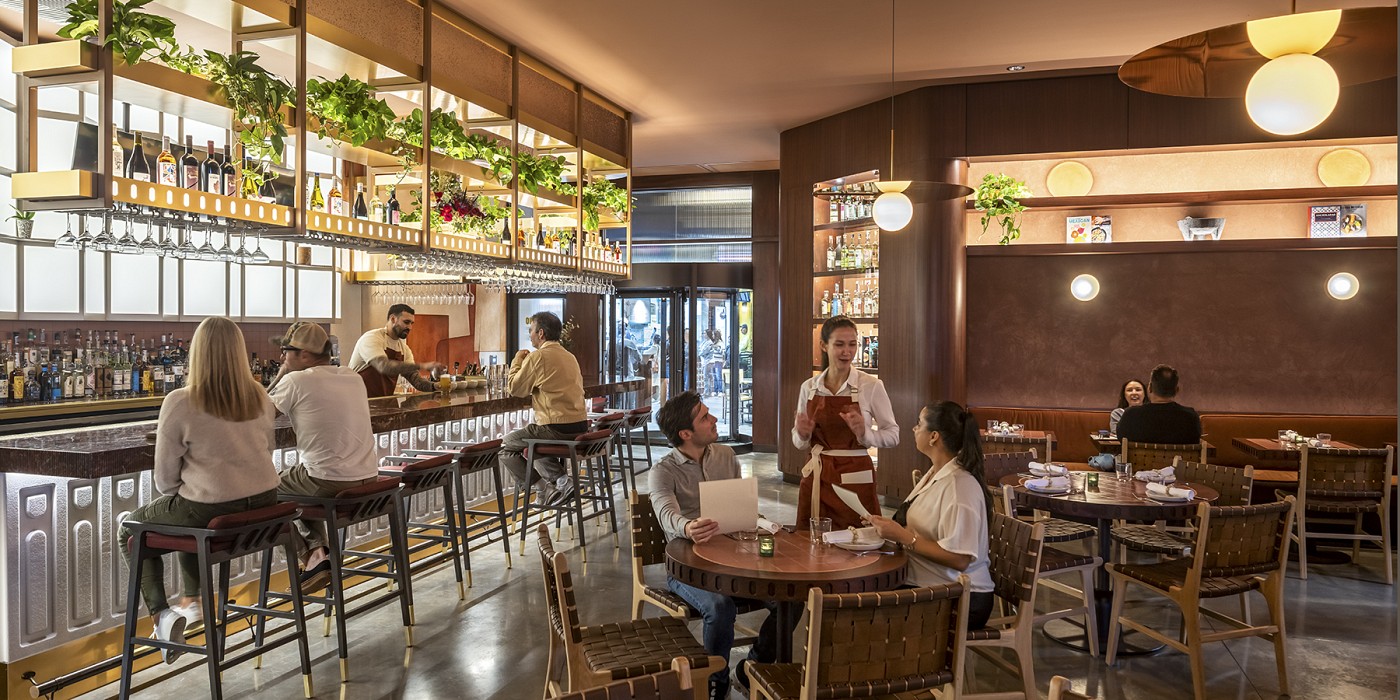
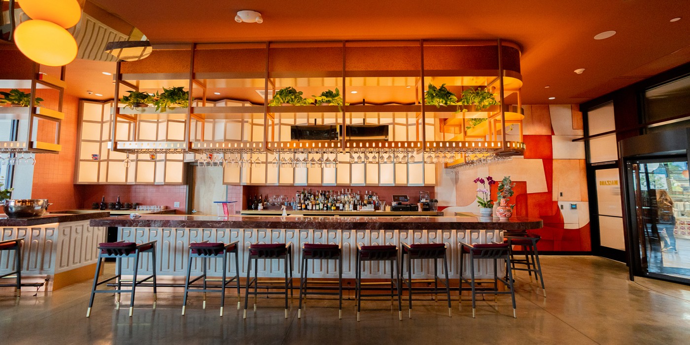
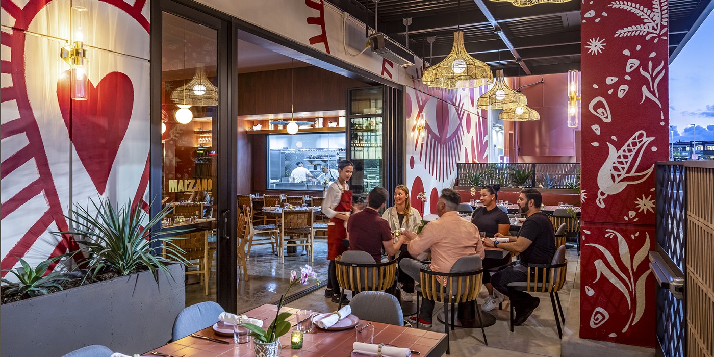
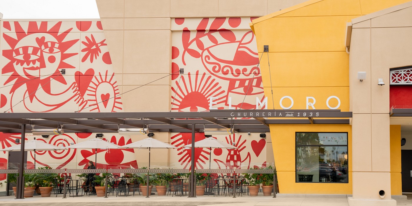
Puestos each focus on an iconic Mexican specialty, whether food or cultural. Cooking puestos feature open kitchens, visible cooking theater, and quick counter seating for that marketplace experience. Important Mexican ingredients like chiles secos (dry hot chili peppers) broke out of being grouped into conventional departments by becoming standalone puestos of specialty displays that capture the vibrant and eclectic feel of a traditional Mexican mercado’s merchandising approach. Puesto vendors ranged from the owner’s own crafted family carnitas recipe, to local taco and torta sandwich trucks going brick-and-mortar for the first time, and an iconic Mexican churro shop opening its first U.S. location. The puestos are enveloped with open areas of communal seating, vibrant artist murals, an indoor bar, two outdoor patios, and a standalone fine-dining restaurant from Mexico-based restauranteurs using the mercado’s ingredients.
Puestos fill the space, creating multiple “streets” or “alleys” for discovery and exploration.
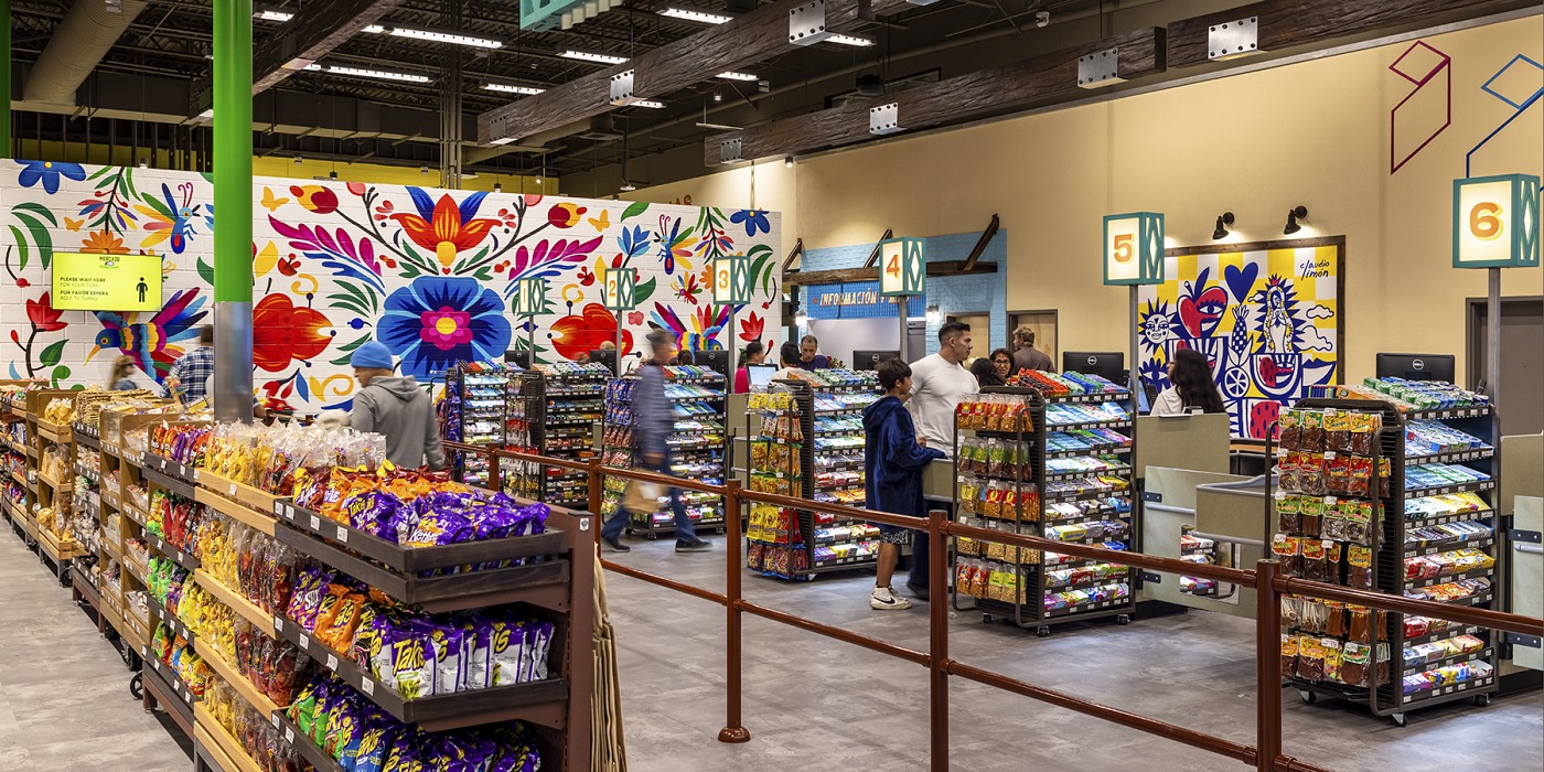
In creating the physical look and feel of the mercado, we crafted each puesto to break from certain unspoken “rules” about consistency within a grocery space. Ceiling heights change from puesto to puesto, colors change, finishes change, typography changes — everything. Within environmental graphics, the throughline was consistency of handpainting everything, or using flat graphics directly on real materials. Retail is often surrounded by dimensional letters, printed faux textures or large professional photographs. While none of those are inherently bad design choices, they don’t feature heavily in the Mexican mercado inspirations Northgate was passionate about. Capturing the spirit of the individual craftspeople through handpainting signage, varied and eclectic typefaces and the visible tactile texture of real materials, even when it’s a hung sign, was the key unifier for environmental graphics. With 123 paint colors in environmental graphics alone, 81 fonts, 115 custom illustrations, 11 artist-painted murals and 323 signs, orchestrating all of the pieces to feel vibrant and eclectic kept it cohesive. Altogether, Mercado González presents a unique opportunity to feel the sights, sounds and tastes of Mexico in a quintessential Southern California space: the shopping center.
Mercado González has become a turning point for the organization in terms of their approach to food retail. The organization now recognizes its greater cultural purpose in this new concept, and the local Mexican community’s response reinforces its place in the market, truly illustrating the power of a place to convene!
Branded as a new format, Mercado González, Shook Kelley designed a unique food shopping and dining experience unlike any traditional grocery store, specialty food market or food hall. It is a rich and robust cultural food journey through Mexico, but based in Southern California.
Shook Kelley developed the idea of creating a “pipeline” of authentic culture between Mexico and Southern California, importing the familiar flavors, sounds, and visual palette that the local Mexican community is familiar with and nostalgic for. Whether long-time immigrants seeking out a memory, new immigrants missing home, or American-born second or third generation immigrants looking for a taste of their heritage, the mercado format created the perfect context for achieving this design goal and differentiating from the industry.
A mercado in Mexico is a traditional marketplace, the kind that eschews the trappings of a typical American supermarket with its bright lights, uniform look and packaged foods. It’s a hub of different individual, specialty merchants that set up their own puestos (stalls), each named and decorated to suit, with an old world approach to visual merchandising. Displays are lush, the senses are piqued, and everything is visible. Shoppers mingle alongside diners. It is not like your standard American supermarket down the street. Shook Kelley worked with Northgate to identify the most compelling parts of a Mexican mercado, and then developed a design that transported its most iconic elements into the gutted former space of a conventional supermarket.
It's a “pipeline” of authentic culture between Mexico and Southern California.
The design broke from traditional supermarket concepts such as locating fresh departments (e.g. deli or butcher) along the perimeter of the store, with rows of packaged products filling the middle. Instead, every unique product category was treated as its own puesto (stall), with its own expert merchant and special recipes cooked in-store. Puestos were designed as standalone stalls with their own individual names, finishes, materials, graphics and signage. They fill the entire floor of the space, creating multiple “streets” or “alleys” to explore, and a circulation flow of discovery rather than the efficiency of gridded straight lines.
Puestos each focus on an iconic Mexican specialty, whether food or cultural. Cooking puestos feature open kitchens, visible cooking theater, and quick counter seating for that marketplace experience. Important Mexican ingredients like chiles secos (dry hot chili peppers) broke out of being grouped into conventional departments by becoming standalone puestos of specialty displays that capture the vibrant and eclectic feel of a traditional Mexican mercado’s merchandising approach. Puesto vendors ranged from the owner’s own crafted family carnitas recipe, to local taco and torta sandwich trucks going brick-and-mortar for the first time, and an iconic Mexican churro shop opening its first U.S. location. The puestos are enveloped with open areas of communal seating, vibrant artist murals, an indoor bar, two outdoor patios, and a standalone fine-dining restaurant from Mexico-based restauranteurs using the mercado’s ingredients.
Puestos fill the space, creating multiple “streets” or “alleys” for discovery and exploration.
In creating the physical look and feel of the mercado, we crafted each puesto to break from certain unspoken “rules” about consistency within a grocery space. Ceiling heights change from puesto to puesto, colors change, finishes change, typography changes — everything. Within environmental graphics, the throughline was consistency of handpainting everything, or using flat graphics directly on real materials. Retail is often surrounded by dimensional letters, printed faux textures or large professional photographs. While none of those are inherently bad design choices, they don’t feature heavily in the Mexican mercado inspirations Northgate was passionate about. Capturing the spirit of the individual craftspeople through handpainting signage, varied and eclectic typefaces and the visible tactile texture of real materials, even when it’s a hung sign, was the key unifier for environmental graphics. With 123 paint colors in environmental graphics alone, 81 fonts, 115 custom illustrations, 11 artist-painted murals and 323 signs, orchestrating all of the pieces to feel vibrant and eclectic kept it cohesive. Altogether, Mercado González presents a unique opportunity to feel the sights, sounds and tastes of Mexico in a quintessential Southern California space: the shopping center.
Mercado González has become a turning point for the organization in terms of their approach to food retail. The organization now recognizes its greater cultural purpose in this new concept, and the local Mexican community’s response reinforces its place in the market, truly illustrating the power of a place to convene!