- You have not saved any projects.
Reasor's
Reasor’s is a 19-store, employee-owned supermarket chain based in Tahlequah, Oklahoma, with stores throughout the Tulsa metropolitan area. Shook Kelley worked with Reasor’s on a Discovery and Brand Strategy, which led to a combination of brand-building projects, including a new brand identity and prototype store in Tulsa.
The new Reasor’s strategy seeks to transform the company into a lifestyle brand that taps into the vibrant culture of Tulsa. In the face of increased competition, including the price-focused value proposition of Walmart and the food culture position of Whole Foods and Sprouts, Reasor’s needed to find a more pointed and proprietary way to tell a meaningful story, distinguish the store experience and deepen their loyal relationship with the community. Shook Kelley developed a brand strategy around the family table and how Reasor’s could promise to “Bring Your Table To Life.”
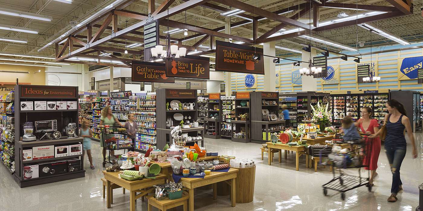
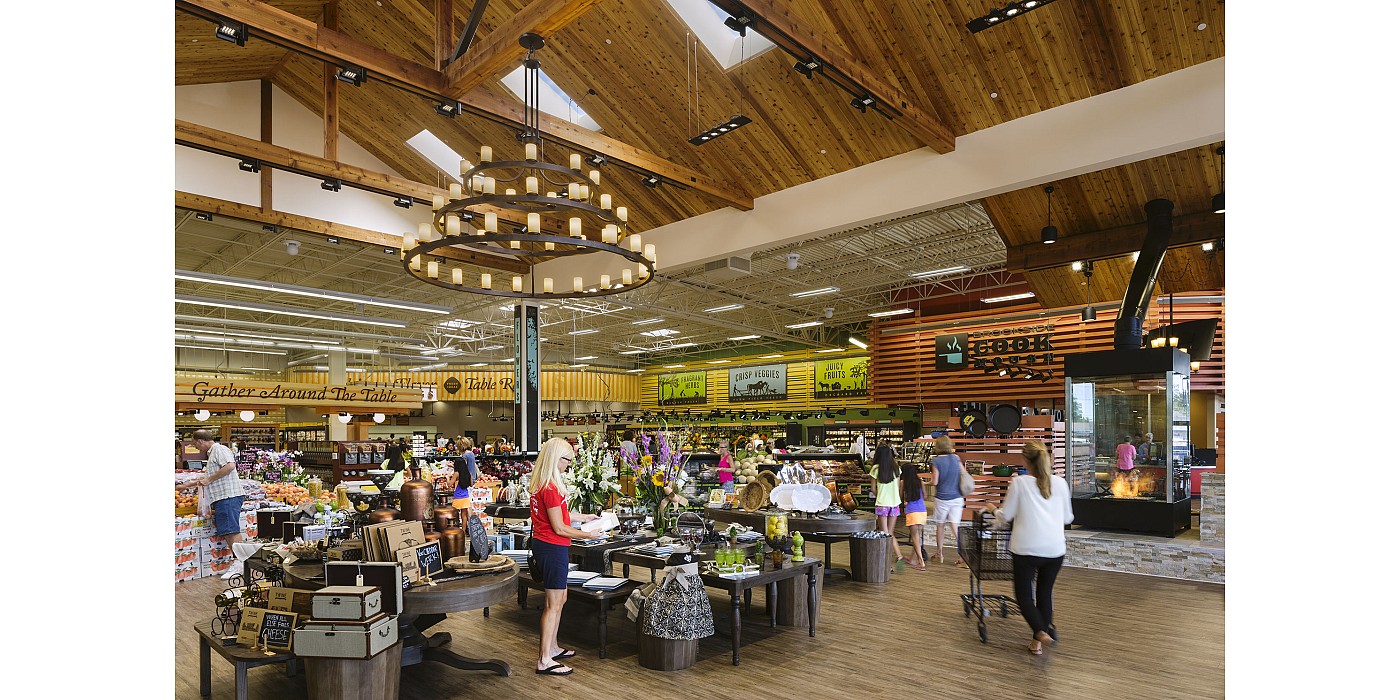
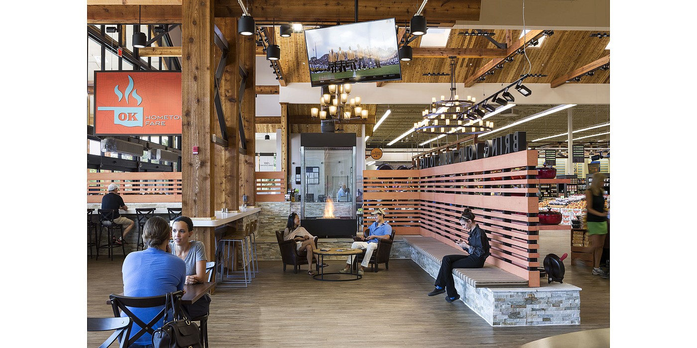
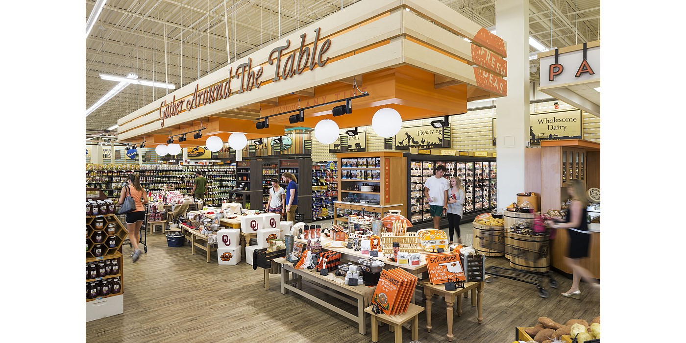
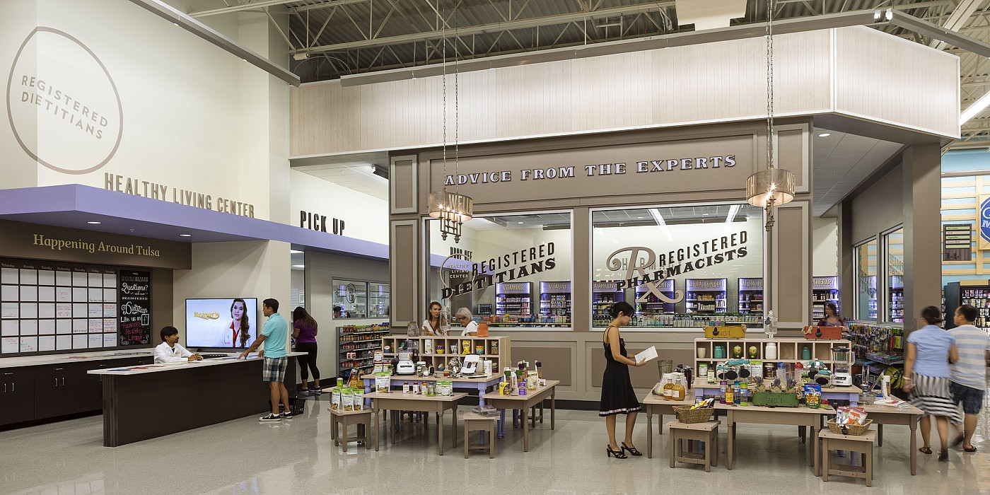
The prototype store translates the Reasor’s brand into a unique experience unmatched in Tulsa. The centerpiece “Tables” program consists of a series of four tables zones that introduces a new range of general merchandise products. Strategically located for optimum department adjacencies, the tables zones offer lifestyle, entertaining and other ideas for gathering occasions in local homes. Not only did Shook Kelley design the Tables zones, but they also created a Playbook to manage an ongoing stream of new Tables Themes and GM product ideas that could work well here.
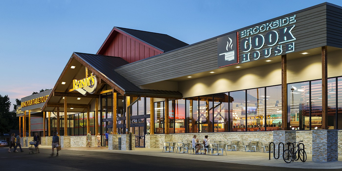
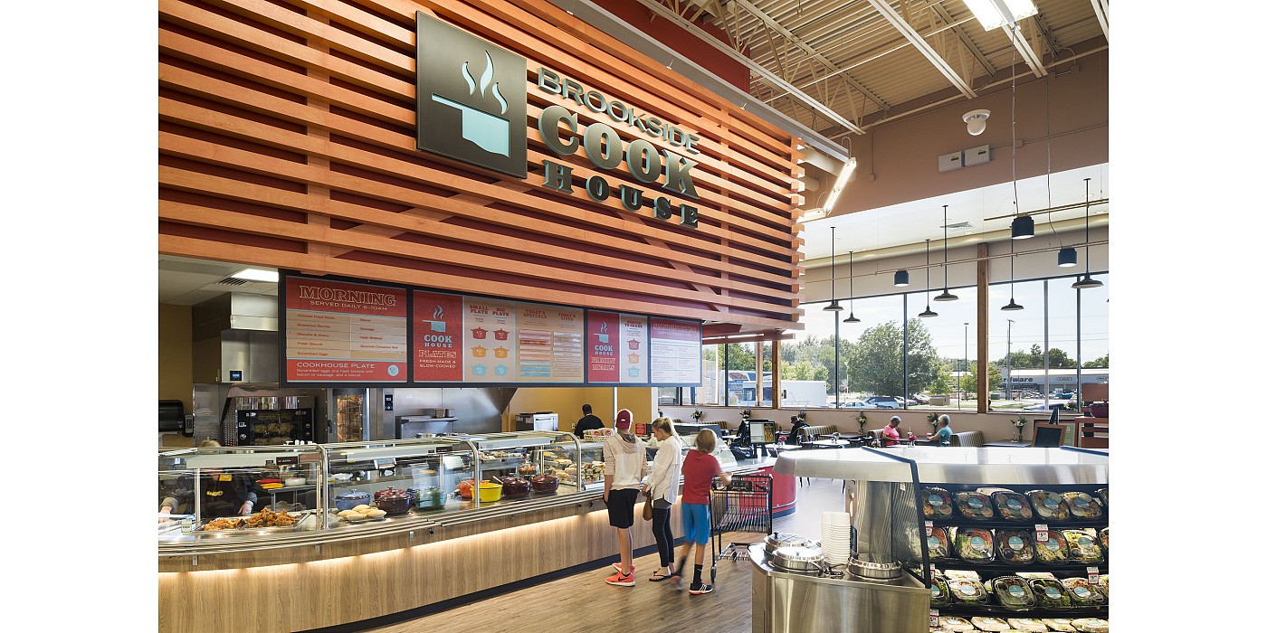
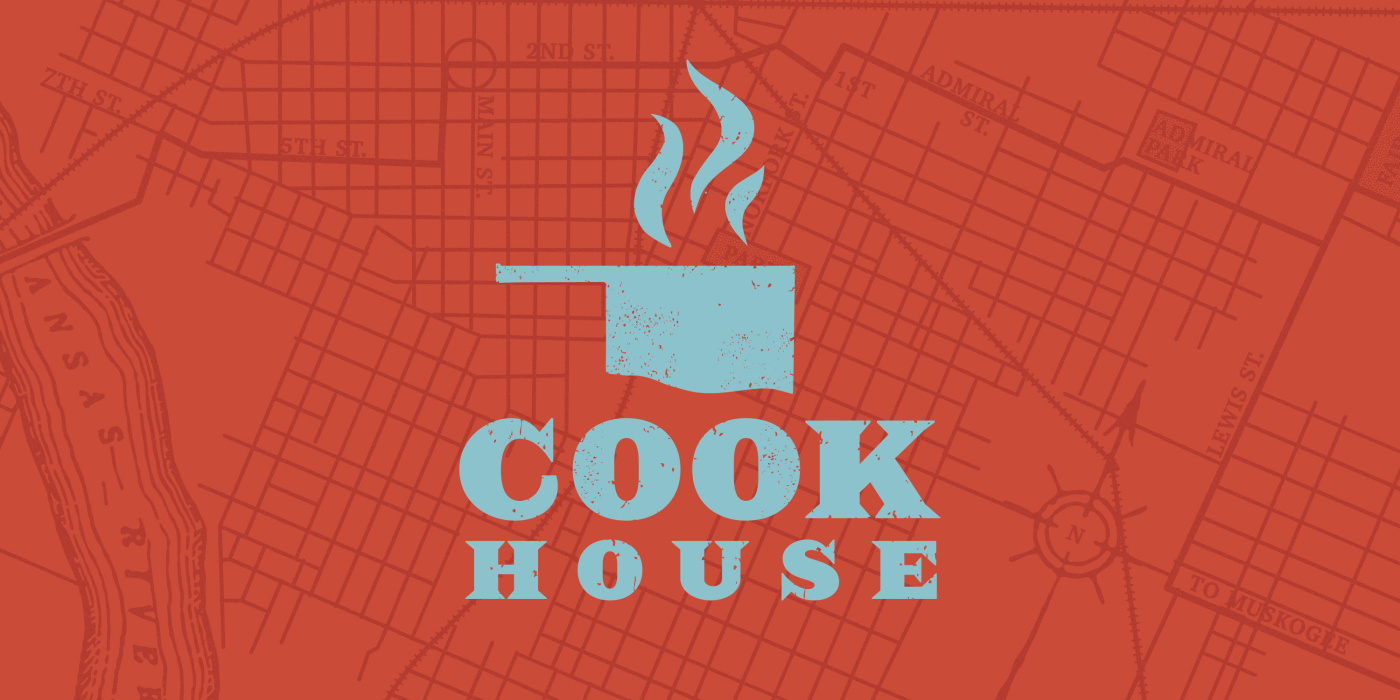
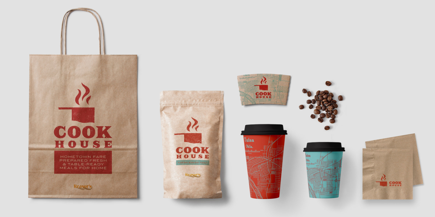
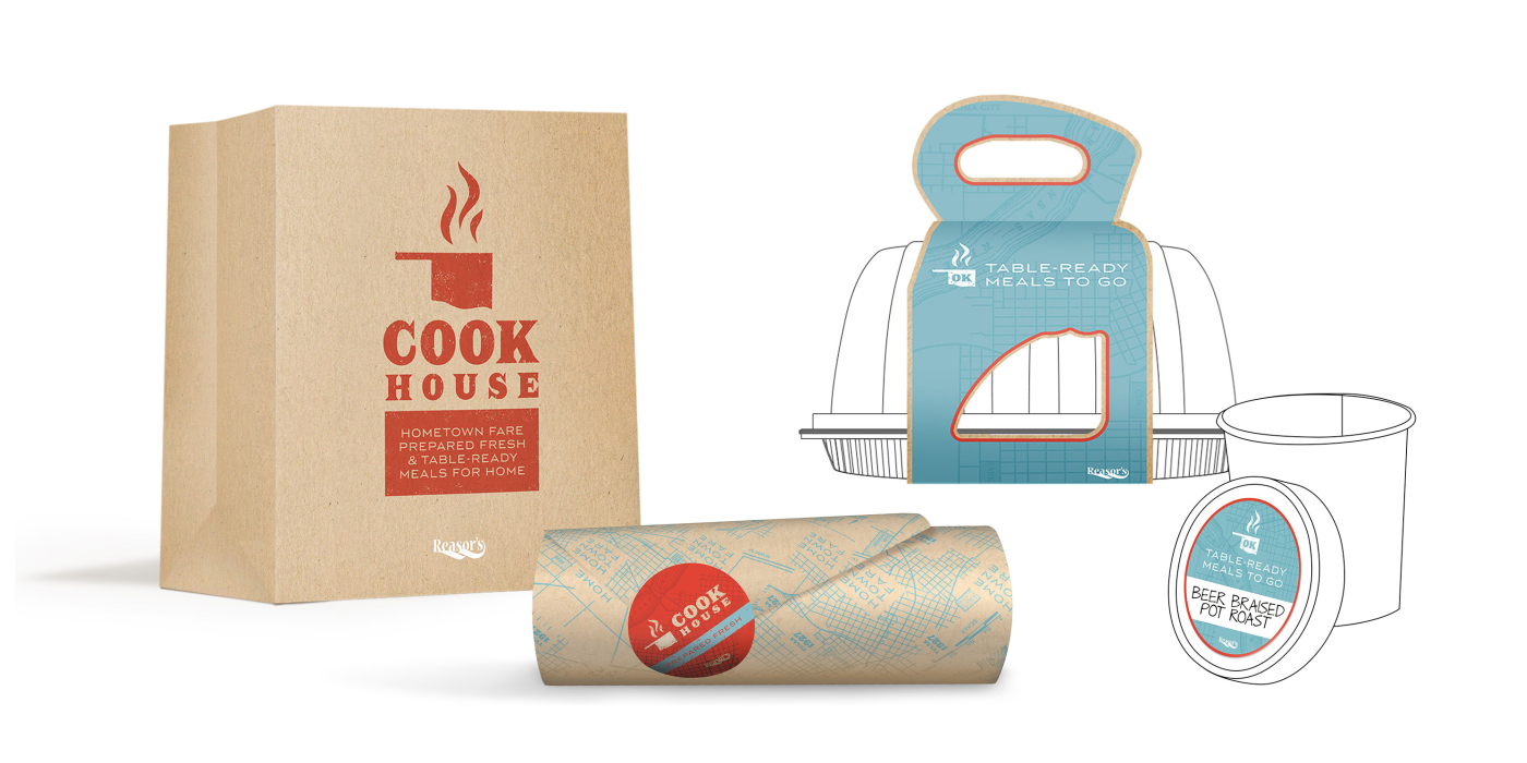
The Brookside outpost of “CookHouse,” here named after the store’s neighborhood, represents an important departure for the Reasor’s prepared foods program, towards a restaurant-quality offering. Shook Kelley developed the CookHouse concept and its Western-inspired logo, which appropriates the shape of Oklahoma as a sizzling pot. This connects directly with the restaurant’s local hometown fare, such as scratch-made Dutch oven specials.
What really sets Reasor’s apart is its meaningful contribution to the Tulsa identity.
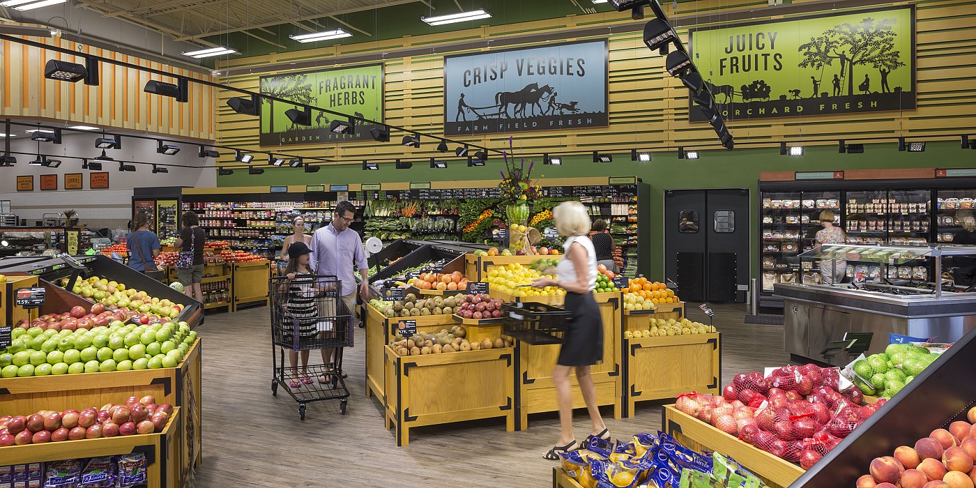
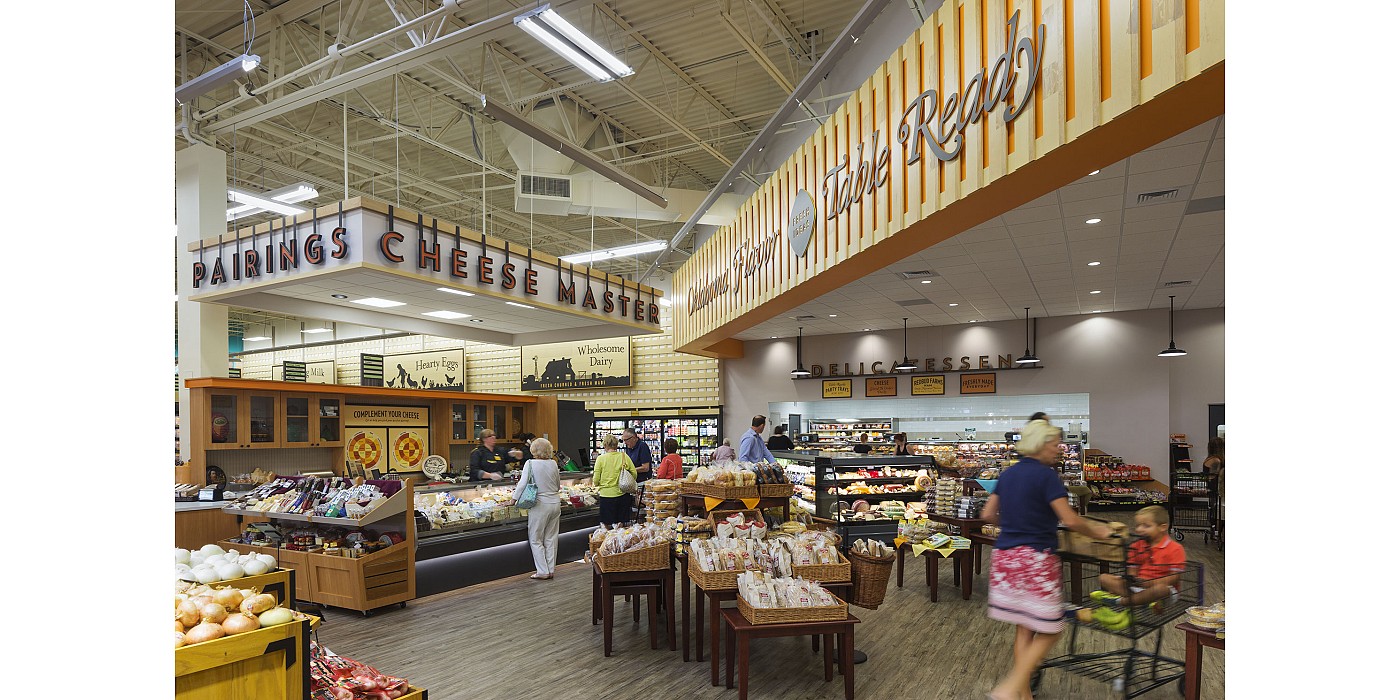
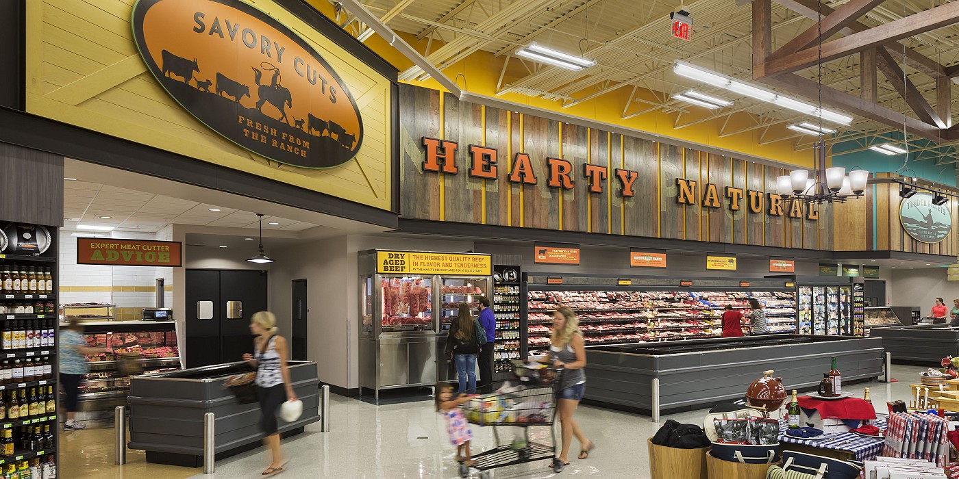
The store’s environmental graphics are inspired by traditional ranches’ rustic metal silhouettes of local pastoral landscapes and scenes. Combined with evocative and refined ranch inspirations, the store environment supports a brand story centered around a series of merchandised table areas, prompting shoppers to explore unique home products. Throughout the store, customers are enveloped in a store environment that is warm and slightly rustic with a contemporary spin, where the latest food culture trends meet the more rural roots of honest Oklahoma food.
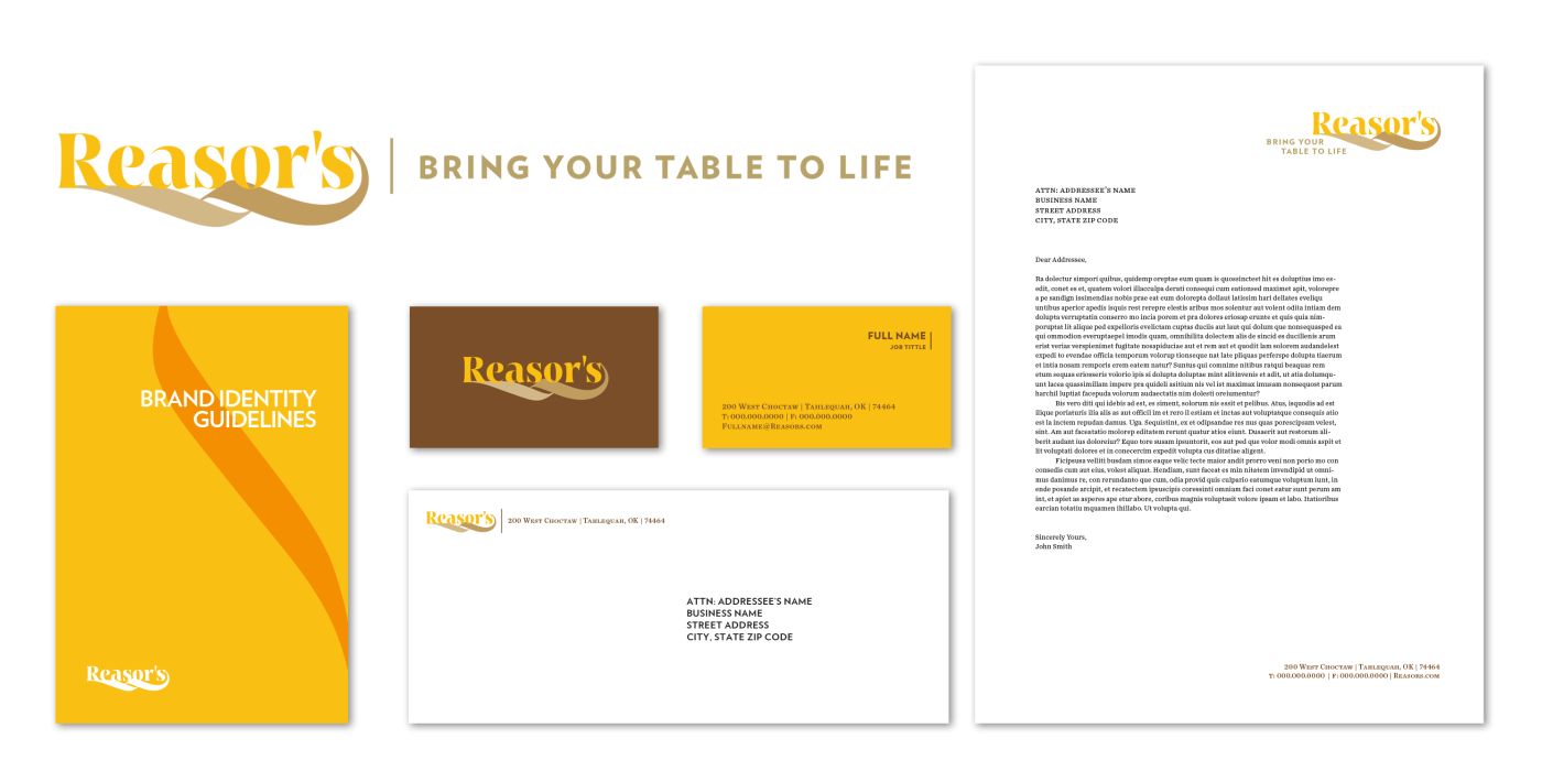
The new brand identity includes a logo inspired by the spirit and typography of traditional paper invitations. Its fleuron shapes and color palette evoke the classic warmth of a gracious host with homegrown roots. Both the identity and the new flagship store design in Tulsa’s Brookside neighborhood embody the new brand promise to “Bring Your Table To Life.”
The prototype store has resulted in increased sales. It has also established a template for a series of store renovations throughout Tulsa, which have increased sales chain-wide. And beyond the sales figures, Reasor’s customers and the internal culture at Reasor’s have been energized by the prototype store and the new brand programs. Local consumers and the local media are taking note of Reasor’s for the first time in years, and in new ways, as the brand has established itself as a source for great food, as well as a store more aligned with Tulsa than their national competitors.
Beyond the financial dividends of the new stores, the Reasor’s projects tap into a social and cultural value that are core to the concept of convening and the brand’s future growth. The store’s revived experience offers an exciting destination to eat food with friends and colleagues, or a place to “see and be seen” while shopping in the local community. But what really sets Reasor’s apart is its meaningful contribution to the Tulsa identity. The store, and the Tables zones in particular, represent an aspirational lifestyle for Oklahoma, one that flexibly aligns with the community’s style and worldview.
The new Reasor’s strategy seeks to transform the company into a lifestyle brand that taps into the vibrant culture of Tulsa. In the face of increased competition, including the price-focused value proposition of Walmart and the food culture position of Whole Foods and Sprouts, Reasor’s needed to find a more pointed and proprietary way to tell a meaningful story, distinguish the store experience and deepen their loyal relationship with the community. Shook Kelley developed a brand strategy around the family table and how Reasor’s could promise to “Bring Your Table To Life.”
The prototype store translates the Reasor’s brand into a unique experience unmatched in Tulsa. The centerpiece “Tables” program consists of a series of four tables zones that introduces a new range of general merchandise products. Strategically located for optimum department adjacencies, the tables zones offer lifestyle, entertaining and other ideas for gathering occasions in local homes. Not only did Shook Kelley design the Tables zones, but they also created a Playbook to manage an ongoing stream of new Tables Themes and GM product ideas that could work well here.
The Brookside outpost of “CookHouse,” here named after the store’s neighborhood, represents an important departure for the Reasor’s prepared foods program, towards a restaurant-quality offering. Shook Kelley developed the CookHouse concept and its Western-inspired logo, which appropriates the shape of Oklahoma as a sizzling pot. This connects directly with the restaurant’s local hometown fare, such as scratch-made Dutch oven specials.
What really sets Reasor’s apart is its meaningful contribution to the Tulsa identity.
The store’s environmental graphics are inspired by traditional ranches’ rustic metal silhouettes of local pastoral landscapes and scenes. Combined with evocative and refined ranch inspirations, the store environment supports a brand story centered around a series of merchandised table areas, prompting shoppers to explore unique home products. Throughout the store, customers are enveloped in a store environment that is warm and slightly rustic with a contemporary spin, where the latest food culture trends meet the more rural roots of honest Oklahoma food.
The new brand identity includes a logo inspired by the spirit and typography of traditional paper invitations. Its fleuron shapes and color palette evoke the classic warmth of a gracious host with homegrown roots. Both the identity and the new flagship store design in Tulsa’s Brookside neighborhood embody the new brand promise to “Bring Your Table To Life.”
The prototype store has resulted in increased sales. It has also established a template for a series of store renovations throughout Tulsa, which have increased sales chain-wide. And beyond the sales figures, Reasor’s customers and the internal culture at Reasor’s have been energized by the prototype store and the new brand programs. Local consumers and the local media are taking note of Reasor’s for the first time in years, and in new ways, as the brand has established itself as a source for great food, as well as a store more aligned with Tulsa than their national competitors.
Beyond the financial dividends of the new stores, the Reasor’s projects tap into a social and cultural value that are core to the concept of convening and the brand’s future growth. The store’s revived experience offers an exciting destination to eat food with friends and colleagues, or a place to “see and be seen” while shopping in the local community. But what really sets Reasor’s apart is its meaningful contribution to the Tulsa identity. The store, and the Tables zones in particular, represent an aspirational lifestyle for Oklahoma, one that flexibly aligns with the community’s style and worldview.