Hello Yellow!
This month, Shook Kelley celebrates its 25th anniversary. Over a quarter century, we’ve been through four visual identities, each with its own unique and brand-defining colors. From a distinct teal, to rich blue in Charlotte and a vibrant orange in Los Angeles, before a detour to refined silver, we’ve now landed upon a cheerful yellow: Hello, Yellow!
What is the significance of this latest choice? What are we communicating to the world? While a visual identity is made up of an entire framework of design choices, color decisions play a prominent role in shaping image, mood and personality. In honor of our birthday, let’s go behind the scenes of our latest visual identity development. As strategy-driven designers that begin all our client work with questions—as you may know, we’re endlessly curious—we begin our own internal identity project with a few questions.
Color Coding
So, what is a color? On a technical and scientific level, color is a physical property attributed to light’s reflection. Color is measurable by light’s wavelength and intensity.
But we are not scientists. We’re more interested in the human experience of color and color perceptions. And that experience, it turns out, has been a point of contention in recent years. From one dimension, pop culture debates have been marked by discussions of the interpretative nature of color. Consider the great blue/gold dress conflict of 2015 and podcast headlines such as, “Why isn’t the sky blue?” And yet, these arguments over the reality of colors speak more so to whether a given color objectively or subjectively exists. That’s fascinating, but not really a good situation for most brand symbols. The meaning of a brand is largely based on what society collectively infers from and sees within it. You can’t just will the brand to have a meaning that people don’t intuitively understand.
While debates around the human facility to perceive color persist, what seems to be without debate is culture’s role in creating, shaping and assigning meaning to colors. That leads to another important question: What do colors mean?
We recognize that a color’s personality, mood and association doesn’t exist on its own merits, but always in relationship to other colors and symbols, too.
Most simply, the meaning of any given color is neither static nor universal. Across different cultures, colors evoke different meanings and moods. Whether it’s through tradition, symbolism or simple association, the changing meaning of color speaks to its very human quality. The meanings change over time. For example, within our own culture, while green used to be most strongly associated with wealth, greed, money and jealousy, a rising environmental consciousness since the 1970s has shifted green towards eco-friendly and natural associations. This shift coincided in large part with its pairing alongside imagery of leaves and nature; and with its hue from blue-greens to yellow-greens. This shift has become so commonplace, there’s even been a backlash in recent years against so-called “greenwashing,” by companies claiming environmental causes for superficial reasons.
Luckily for us in developing a brand’s visual identity, while color associations are always changing, these meanings evolve over years and decades not days—ensuring that we can help brands take a thoughtful and appropriate step when embracing a new color.
So then we come to the question, how do colors have meaning? Colors are meaningful because they have personalities, moods and associations. As designers, selecting just the right color requires deep contemplation. We recognize that a color’s personality, mood and association doesn’t exist on its own merits, but always in relationship to other colors and symbols, too. It’s all part of a larger visual exercise around what we want to signal to a viewer. Turquoise can quickly evoke the arid heat of the American Southwest when paired with sunset oranges and canyon tans. But matched with deep rich blues, warm stucco white and brassy tans, turquoise feels immediately Mediterranean. Red can signify luck and prosperity in China at a wedding, but aggression and shame in the U.S. (like The Scarlet Letter). In other words, the meaning of a color cannot be viewed in objective isolation.
Colors are just one facet of any given visual image or symbol-making process. While we can talk about color in isolation, color cannot magically stir our emotions without all of these other forces at play. Instead, it is more accurate to consider color as one component that can convey cultural meaning, alongside shape, form, line, movement, balance and a host of other qualities, not to mention the complex history and context of related symbols. So, despite the misguided “color psychology” that suggests color can overpower any message’s intent—for example, the pop psychology theories that McDonald’s can stimulate your appetite with its yellow, orange and red color palette (we all know it’s the french fries!)—color choices are always strategically situated within a broader field of circumstances.
Hello Yellow!
Which brings us back to our original question: What is the significance of introducing yellow into the Shook Kelley brand?
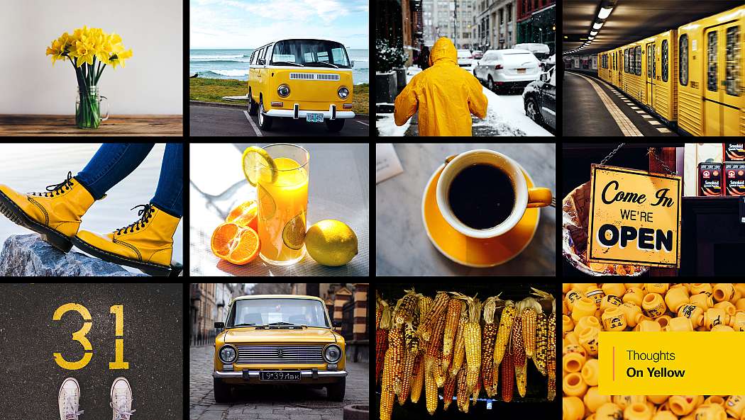
First, consider some different ways that yellow could be interpreted. Bright and saturated yellow is a vibrant and cheerful color that communicates optimism, friendliness and energy. It can also be associated with caution and safety, or shock and value. Yellow on a school crossing sign or painted on a local road captures attention to signal safety. Yellow price signs in a grocery store grab attention to convey “Sale!” or a promotion—it would be weird to see deep rich purples shouting “Sale!” in any American retail context. Yellow happy faces and emojis are ubiquitous and accepted for their friendly cheerfulness. Yellow daisies and lemonade evoke the lighthearted freedom of summer, because yellow taps into the feelings of heat, vacation and sunshine. It’s spontaneous and lighthearted. Yellow often represents light, and its association with enlightenment and knowledge. Yellow shoes stand out in a crowd of neutrals. It can be a bold and clear expression of individuality.
Shook Kelley doesn’t shy away from any of these associations (except for “cheap” maybe), including some of the meaningful contrasts. For all of these reasons, our brand yellow has been named “Hello Yellow!” and paired with a modern Charcoal Gray and accent Red-Orange. Within the Shook Kelley lens and universe, Hello Yellow! captures some of the tensions that we believe in, especially in the relationship between everyday life and exceptional experiences:
- Thoughtful strategy + design for “everyday” experiences. A convenience store can become a respite from everyday hassles. A cookie aisle can evoke memories of mom and after-school snacks—not just commodity price comparison.
- Making “everyday” extraordinary. A grocery store experience does not have to be a chore. Grabbing “quick” food can still be healthy, gourmet and tasty.
- Solving a problem for consumers, “everyday.” Finding and connecting with my tribe between weekend errands fulfills a different side of me. Opening a window to new friends is the ultimate experience.
We try to provoke, to question, to challenge—all with a sense of empathy and cheer. Shook Kelley puts our clients on alert! We consider a wider range of perspectives, making our clients more aware of their various contexts and calling out issues that most people aren’t paying enough attention to. And we do it in a friendly way.
Hello Yellow! stands out as a beacon for these values and connects with this mission. Charcoal Gray serves as a modern and more refined backdrop to complement that image. (For a contrasting comparison, imagine how Hello Yellow! would read very differently next to McDonald’s Red). The egalitarian and “everyday” associations of yellow are a bonus in our eyes. It symbolizes our rejection of many traditional design values that places too high a regard on aesthetics, style and monumental beauty. As a designer of everyday life, Shook Kelley impacts large audiences. In short, our yellow is about convening around every tribe’s everyday lives.